The brief
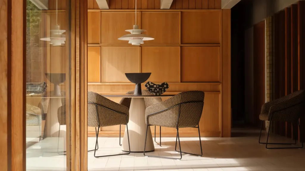
Belvedere design, make and fit aluminium windows and doors from their own factory in Clayton West, as a Cortizo fabricator. The range runs from windows and sliding doors to bi-folds, entrance doors, rooflights and curtain walling, sold to homeowners, developers and architects.
They came to Crushing for brand positioning and an identity, and they were clear from the start about how they wanted to come across: matter of fact, no waffle, let the work speak for itself. For a business that makes its living on tolerances, that was the right instinct. The people buying from them are putting glazing into their own homes, or specifying it on a building with their name on the drawings. They want to know it will fit, it will last and it will turn up when it was promised.
That shaped the whole brief. The identity had to look as though it came out of the same workshop as the frames, sit comfortably next to Cortizo, the system Belvedere fabricate, and give a growing business one consistent way to present itself on everything from a quote to the website.
The approach
We started with the market. Twenty-nine competitor logos, a wall of colour references and eighty-four inspiration images went into the research, with Cortizo’s own mark filed under brands to align with. It showed what the sector already looked like, and what Belvedere would be standing next to.
From there we drew three routes, each built around a different version of the name. BW&D kept the ampersand in. BWD cut it down to three letters. And Belvedere spelled the name out in full. Belvedere chose BWD, and one route went through a revision round before it was signed off.
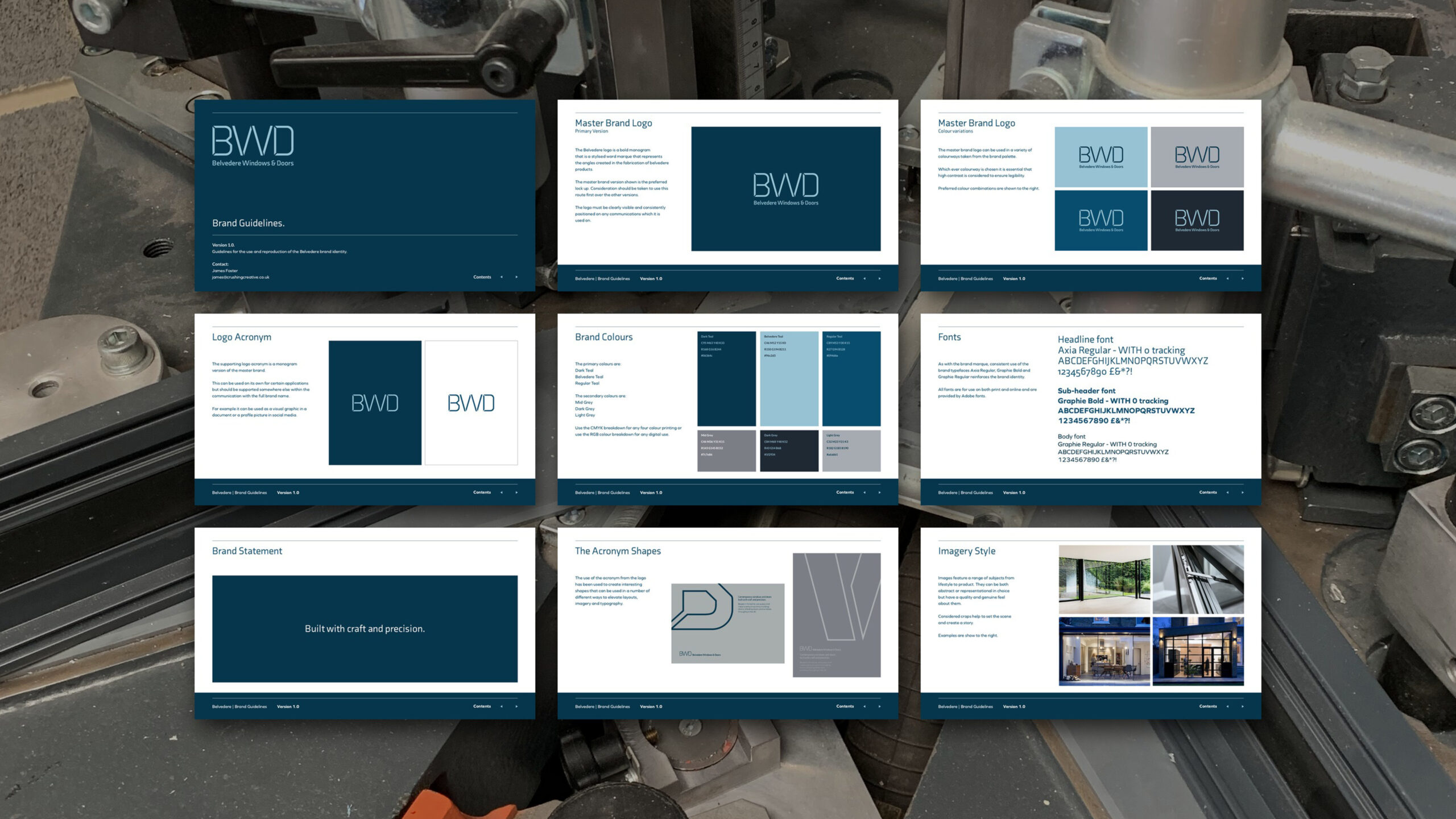
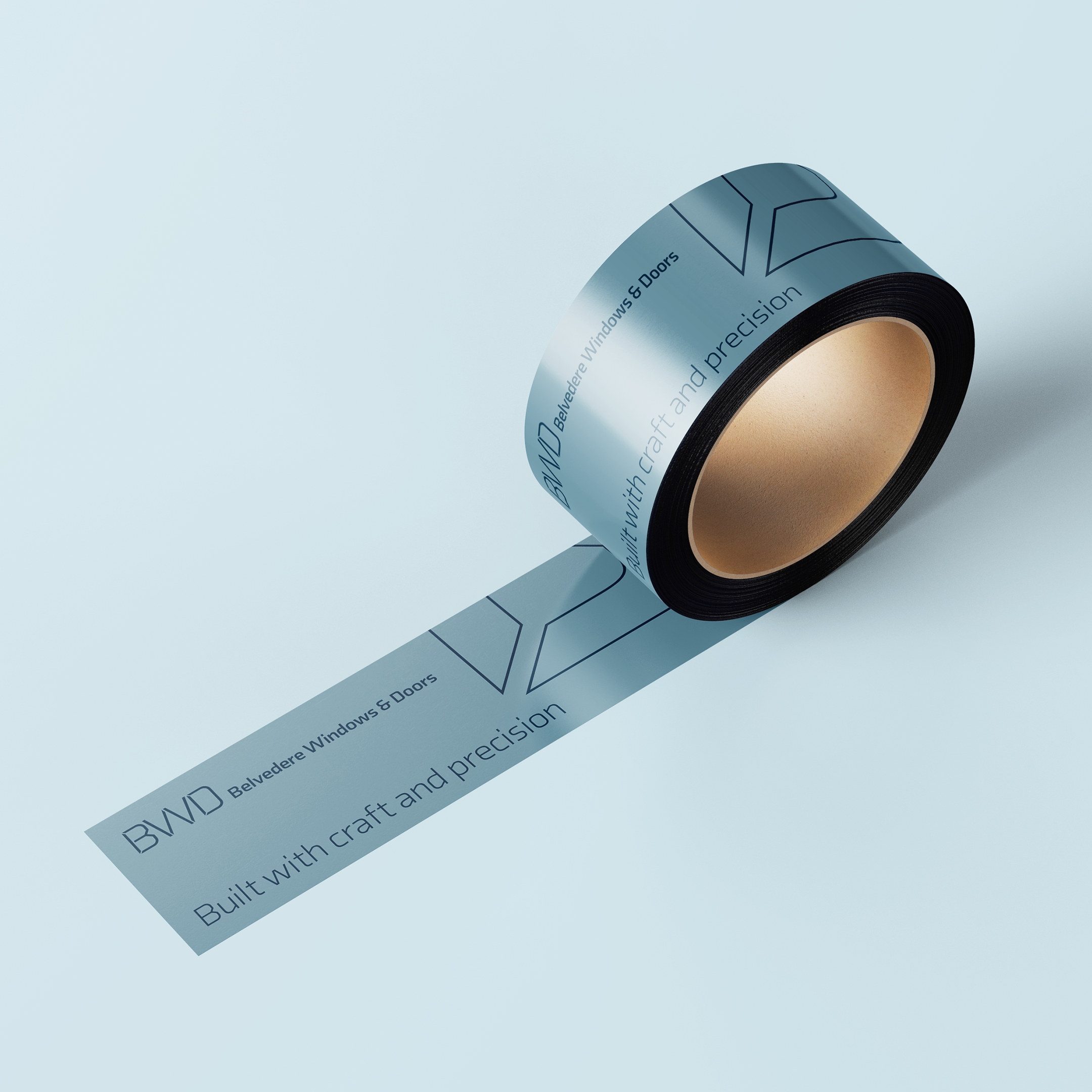
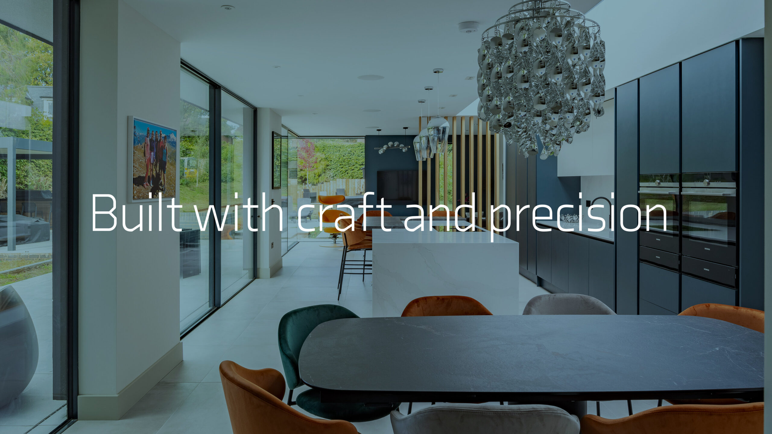
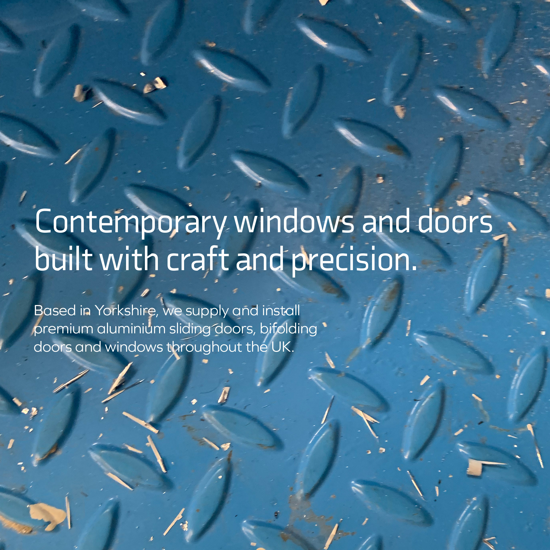
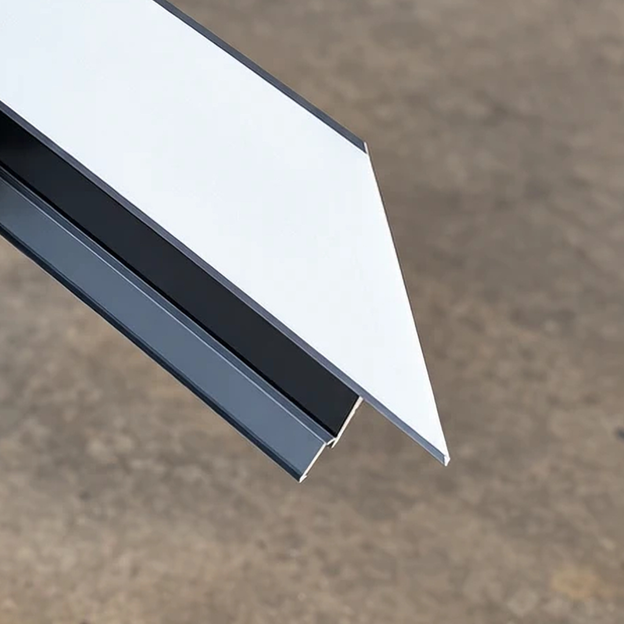
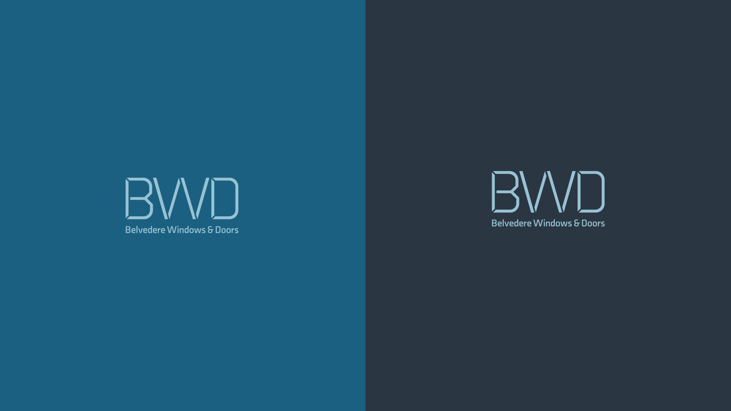
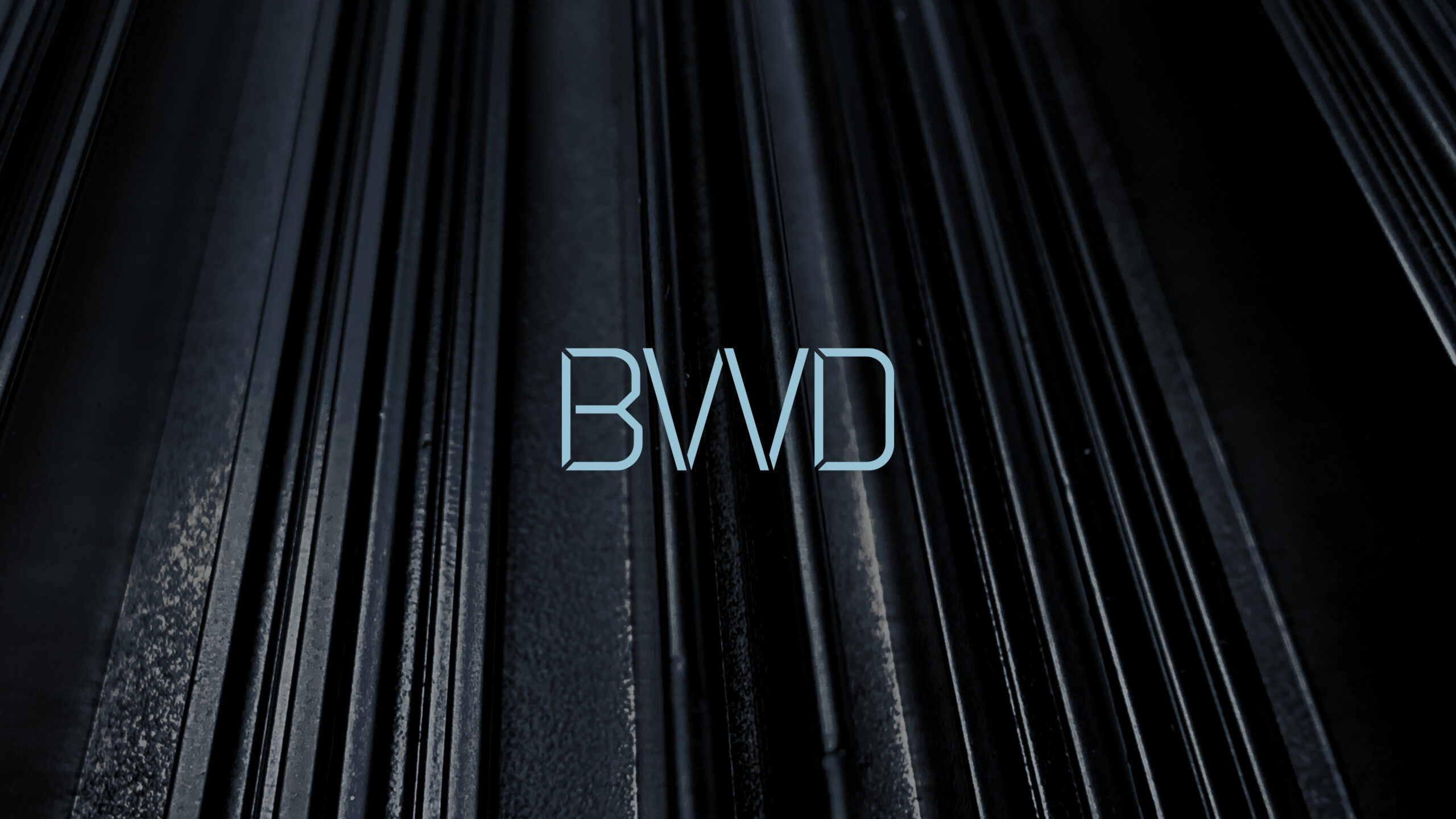
The monogram is where the brand positioning shows. Its angles come from the cuts made fabricating the frames, so the mark is drawn from the work itself rather than from a font menu. The signed-off version is a stencil, and it sits over one line that says what the company does without dressing it up: Built with craft and precision.
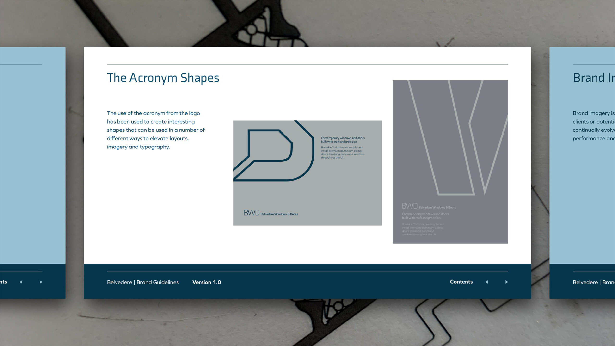
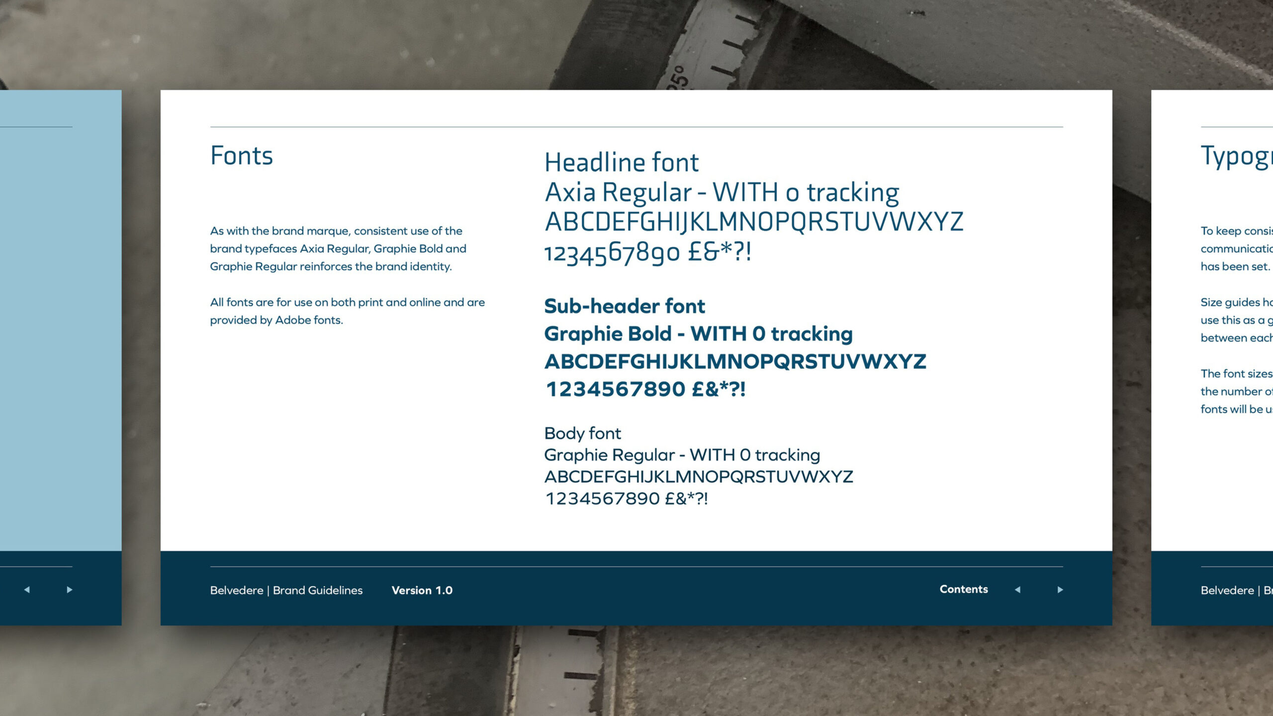
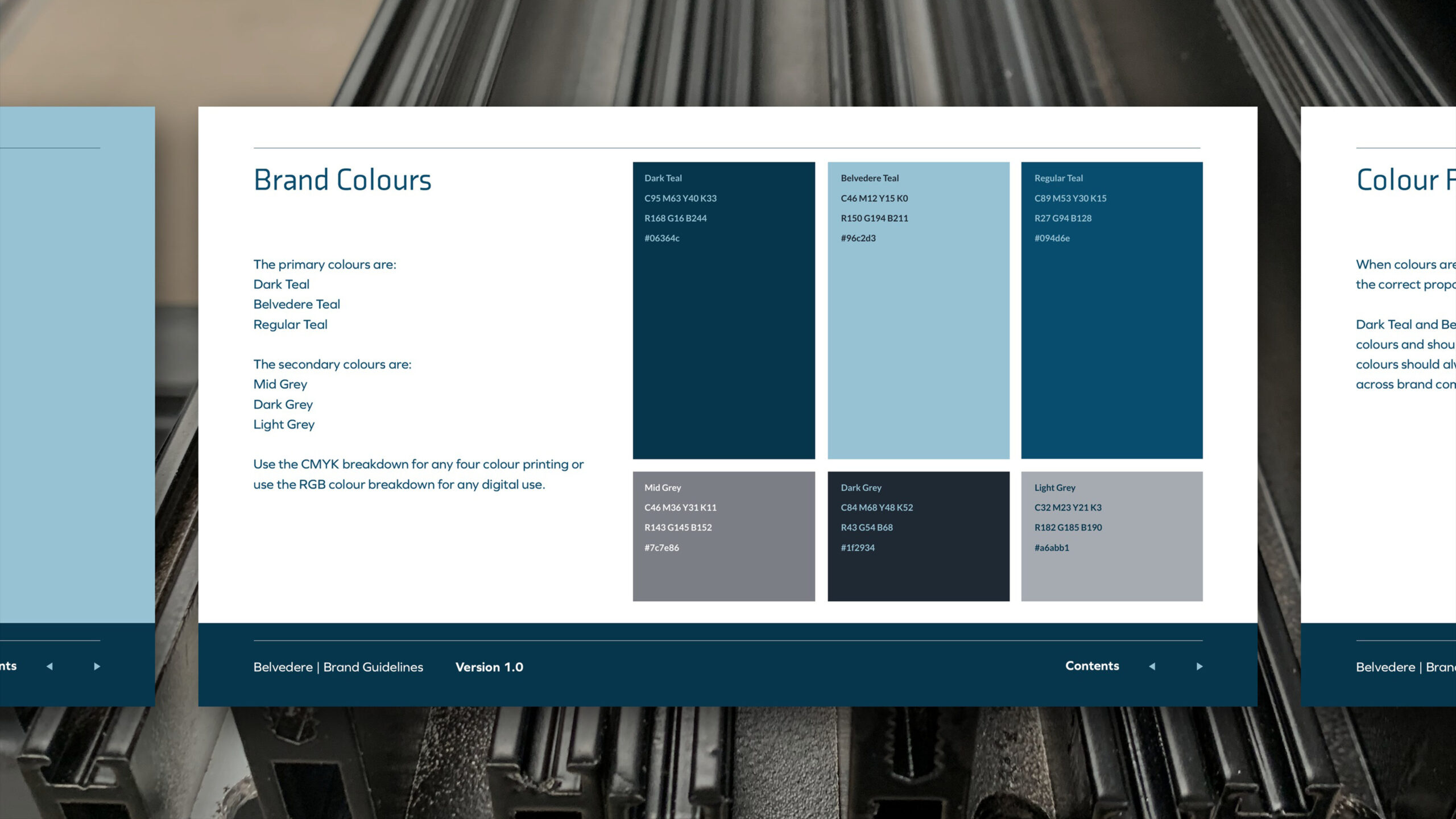
The type pairs Axia with Graphie, and the palette is three teals and three greys, each with its print and screen breakdowns. The shapes cut from the acronym became a supporting graphic, so the brand has something to work with on the pages and surfaces where the full mark would be too much.
What was done
The guidelines set it all down across thirty-two pages: the master mark, the acronym and its shapes, the colourways, the palette, the typefaces, the imagery style and the brand statement. Behind them sits a full set of logo files, nine colourways across three lockups, so nobody at Belvedere has to guess which version goes where.
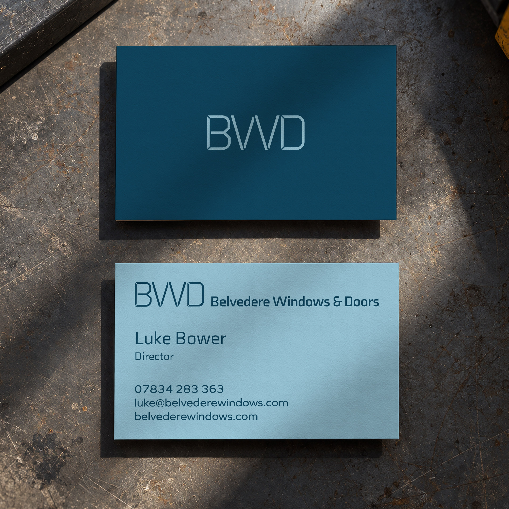
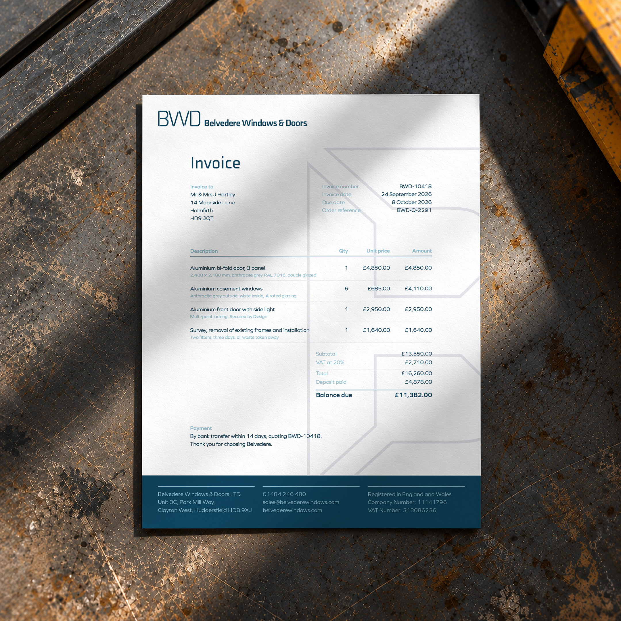
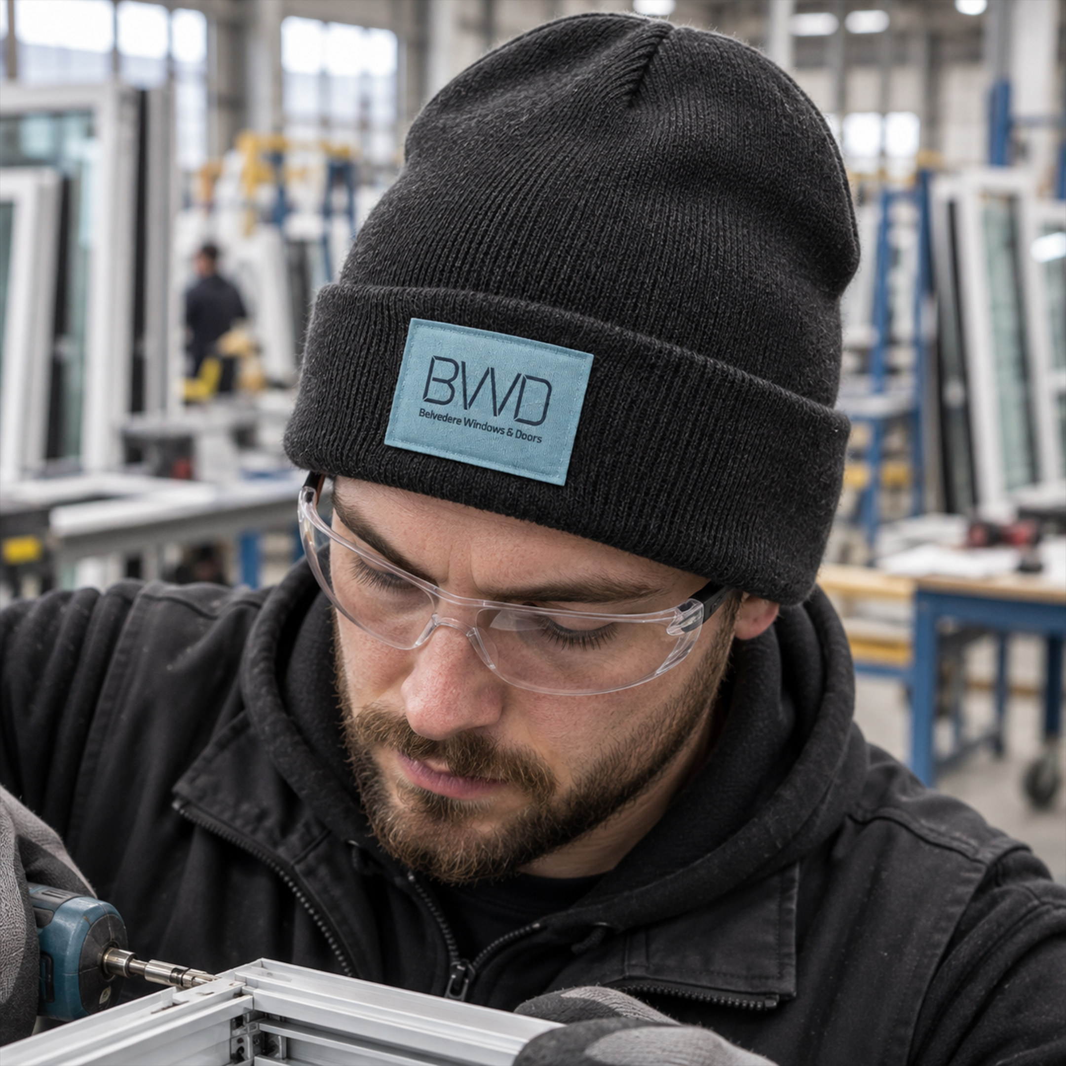
Then the everyday things. The letterhead and business cards, the email signature and templates for social posts. A photo shoot in the workshop gave the brand its own pictures, with thirty-seven chosen from over a hundred, so the product is shown where it is actually made.
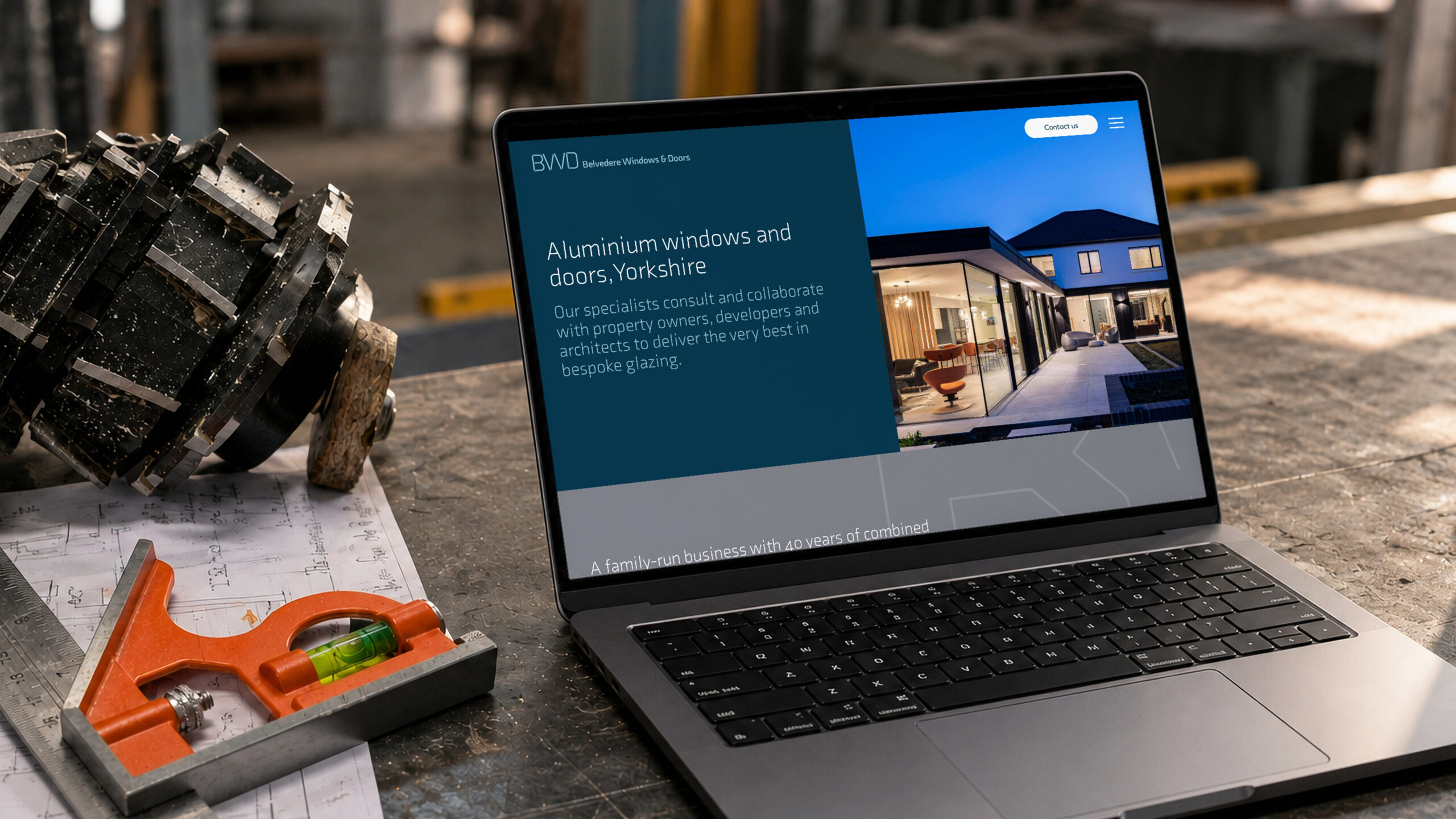
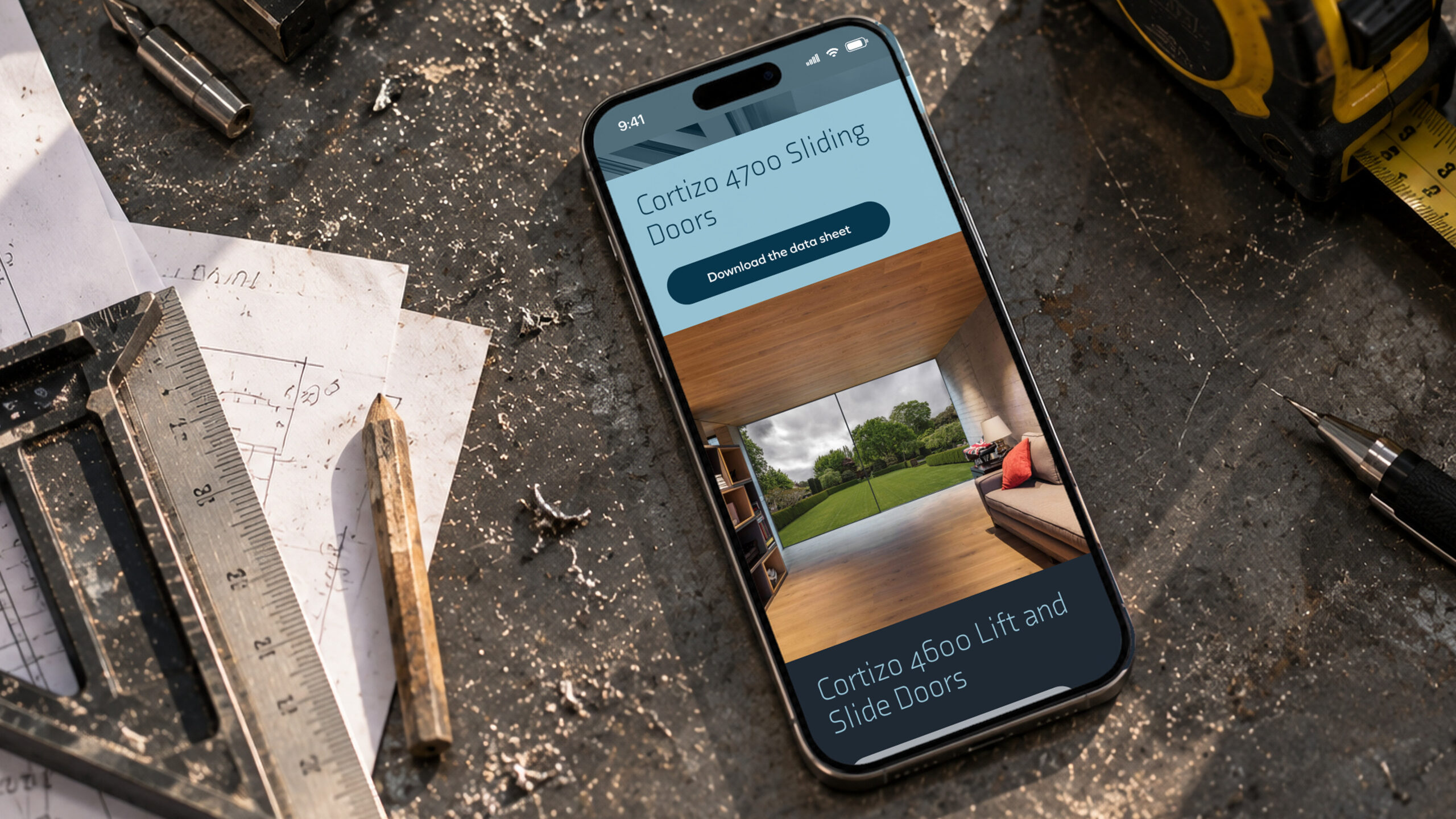
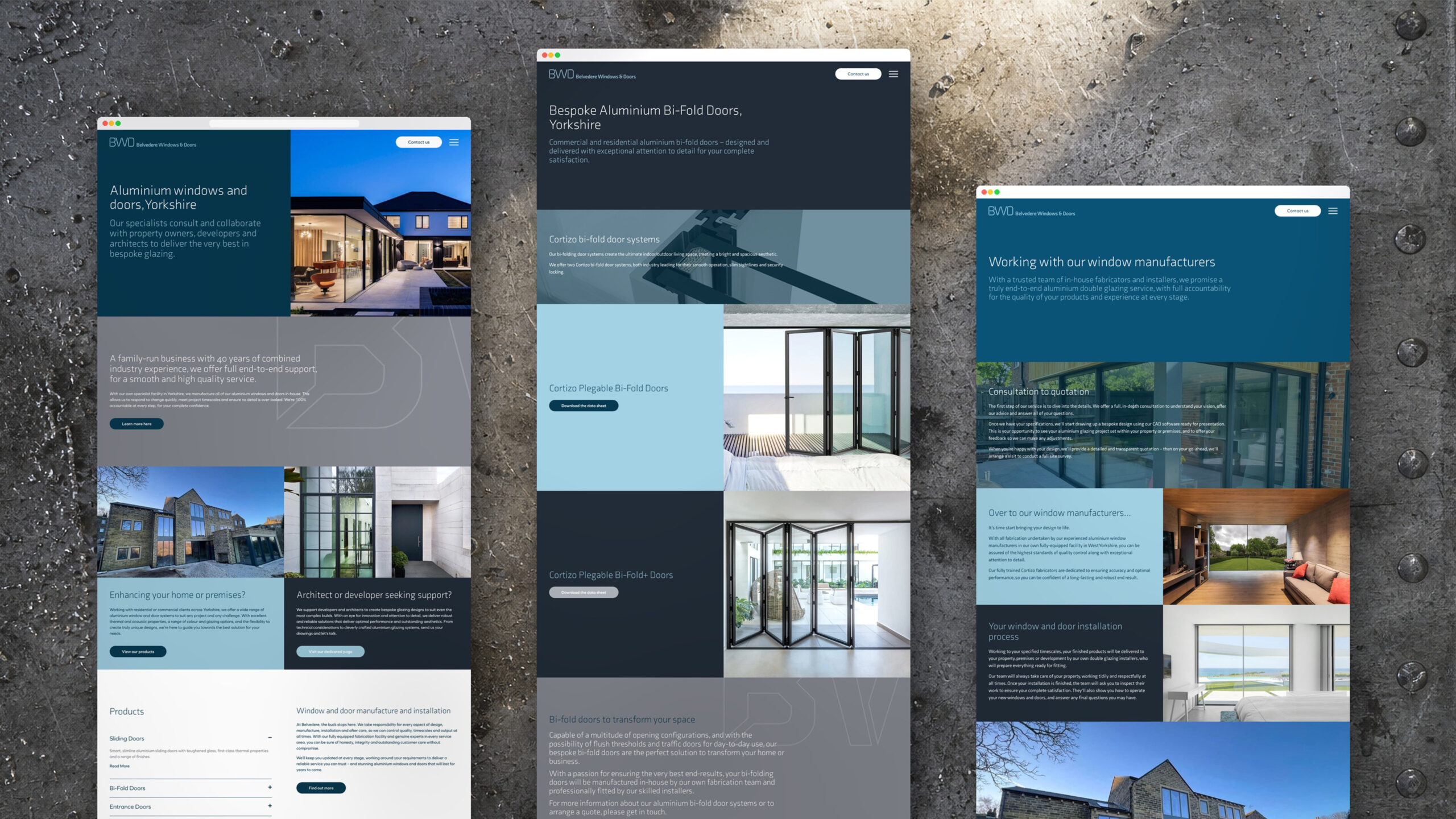
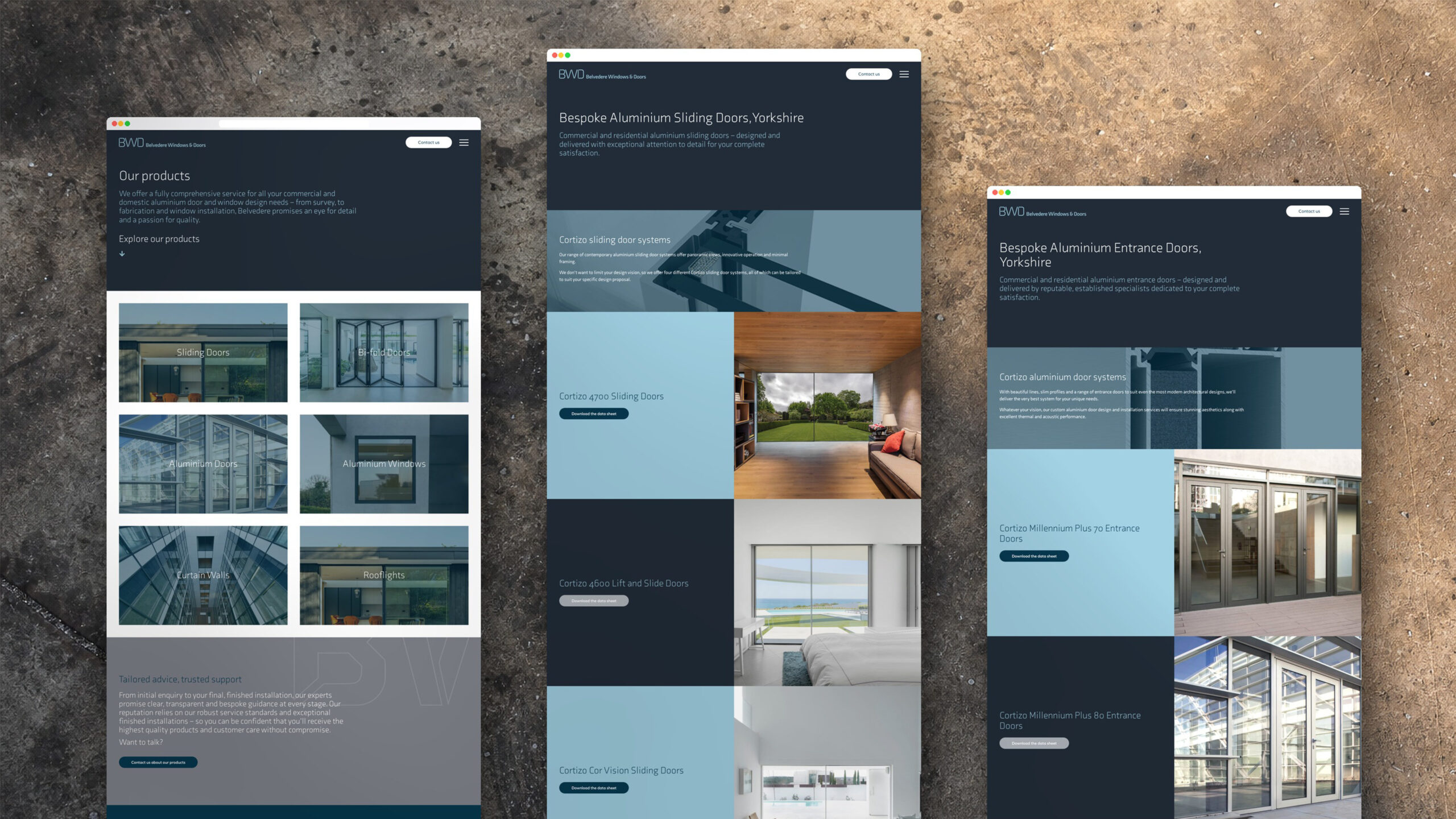
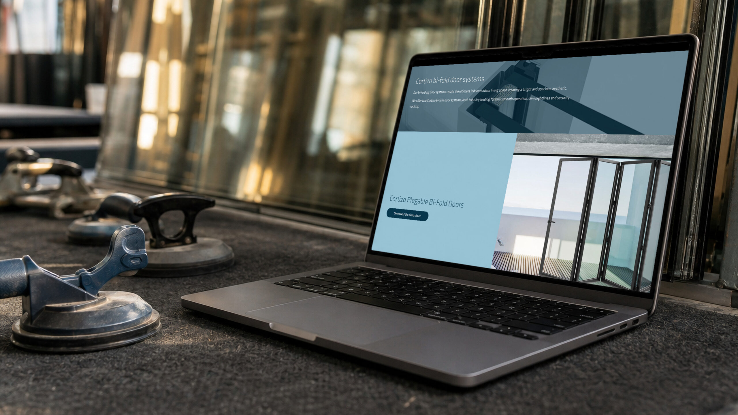
When Belvedere wanted the bigger, more bespoke projects that come through architects, the website followed on the same identity. We designed it, and the keyword strategy, sitemap and copy were written to the same tone they set at the start: plain, specific and without overselling. Every product, from sliding doors to bi-folds, has its own page.
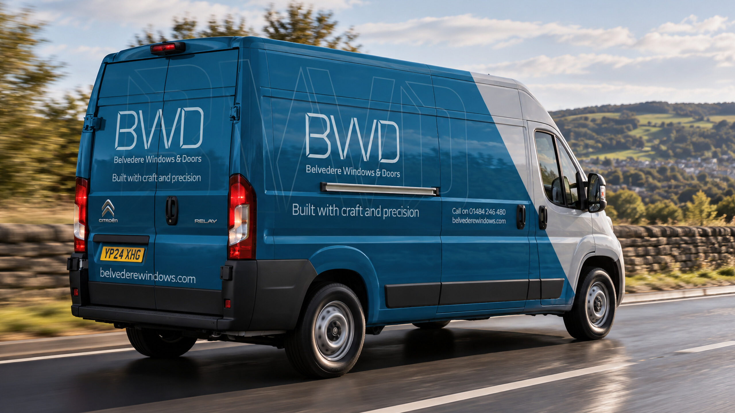
Five years after the identity, the new van signage came to us too, on the same teal and the same mark. It is the clearest test a brand gets. If it still holds on a vehicle driving round West Yorkshire, it was drawn properly in the first place.