The brief
Priory Farm grow their own potatoes in Yorkshire and make vodka from them. They had the vodka and no brand or packaging design, and it was going on a shelf next to the big names.
That is a hard place to start. The spirits shelf is crowded with brands that have spent decades and serious money looking established, and a new vodka from a farm cannot outspend them. What it can do is be something they are not. Priory’s difference was the farm itself: potatoes grown in their own fields, distilled and bottled in Yorkshire.
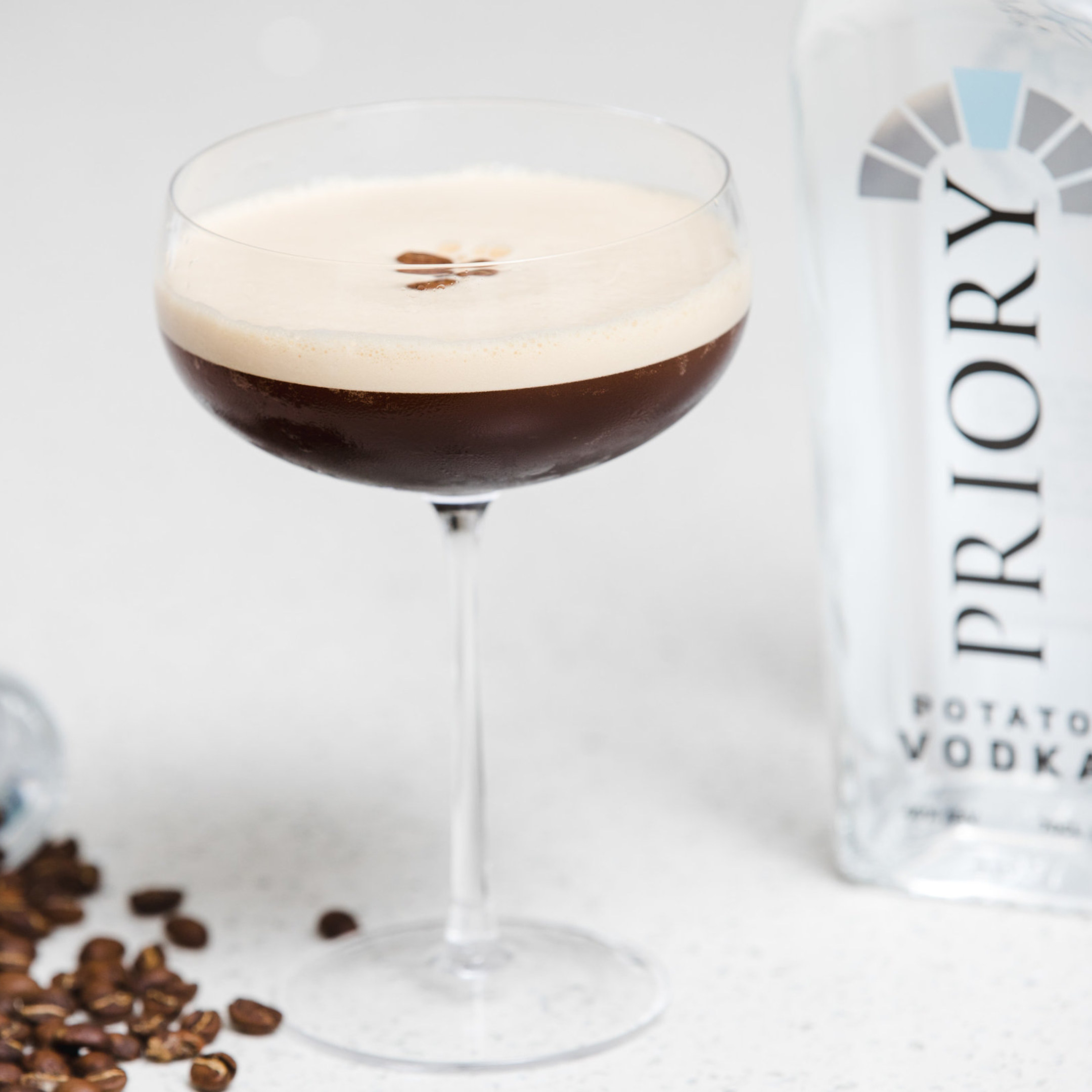
So the farm had to come through on everything the brand went on, from the label to the photography. At the same time the bottle had to stay the hero. A brand that talked too much about fields and sacks would end up looking like a farm shop, and this had to sit comfortably behind a bar.
The brief was a brand that could hold both: premium enough for the shelf, and honest about where the vodka comes from.

The approach
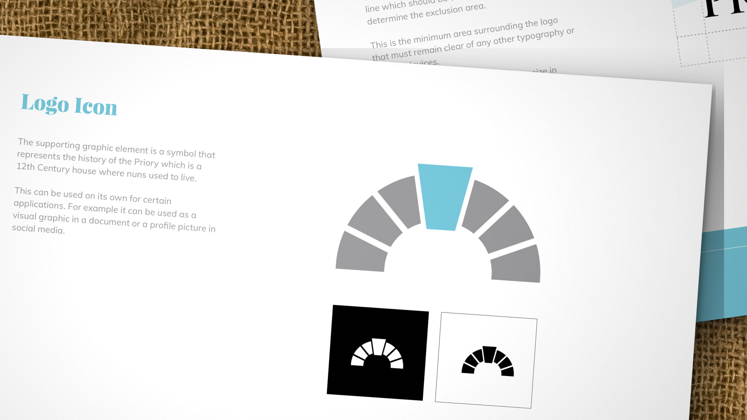
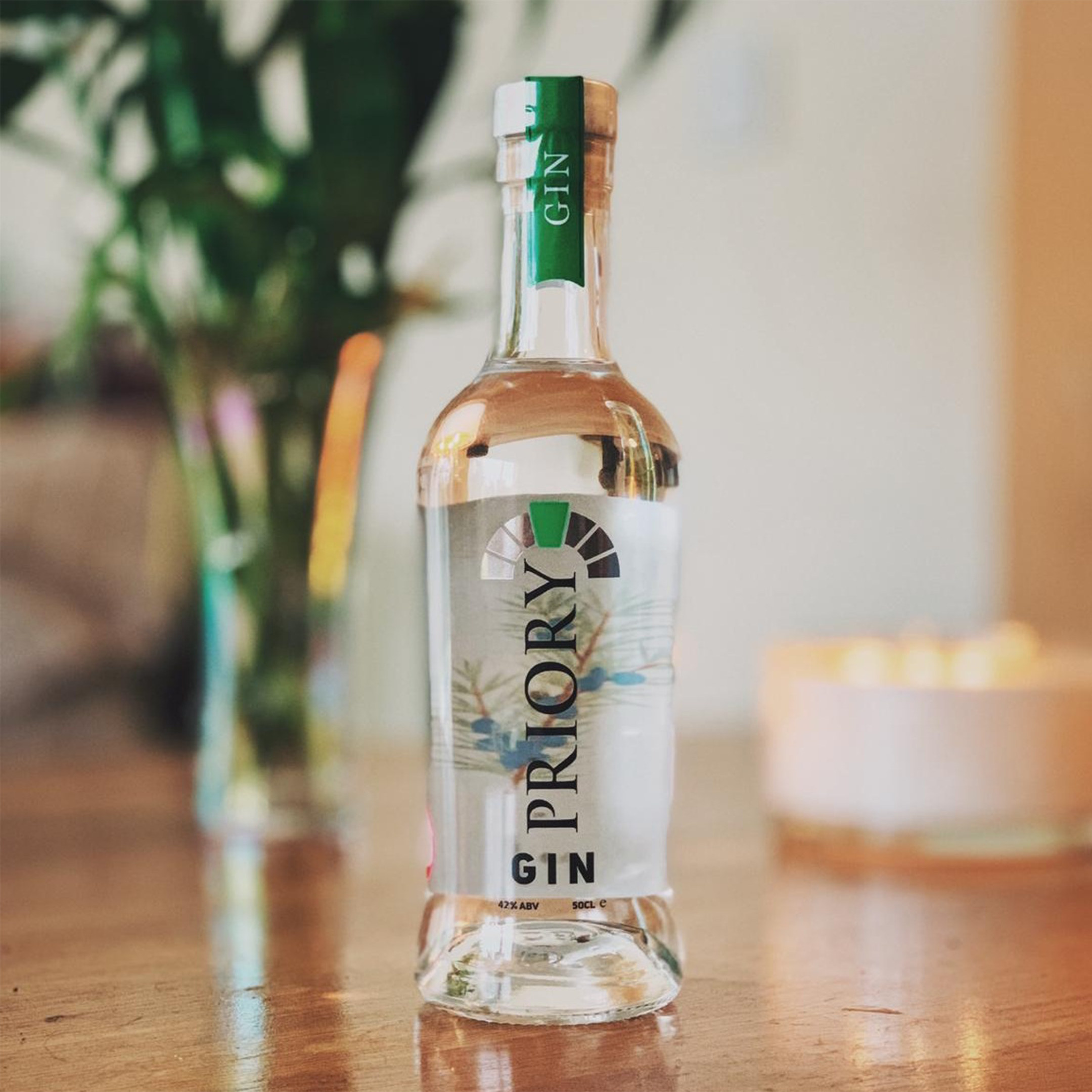
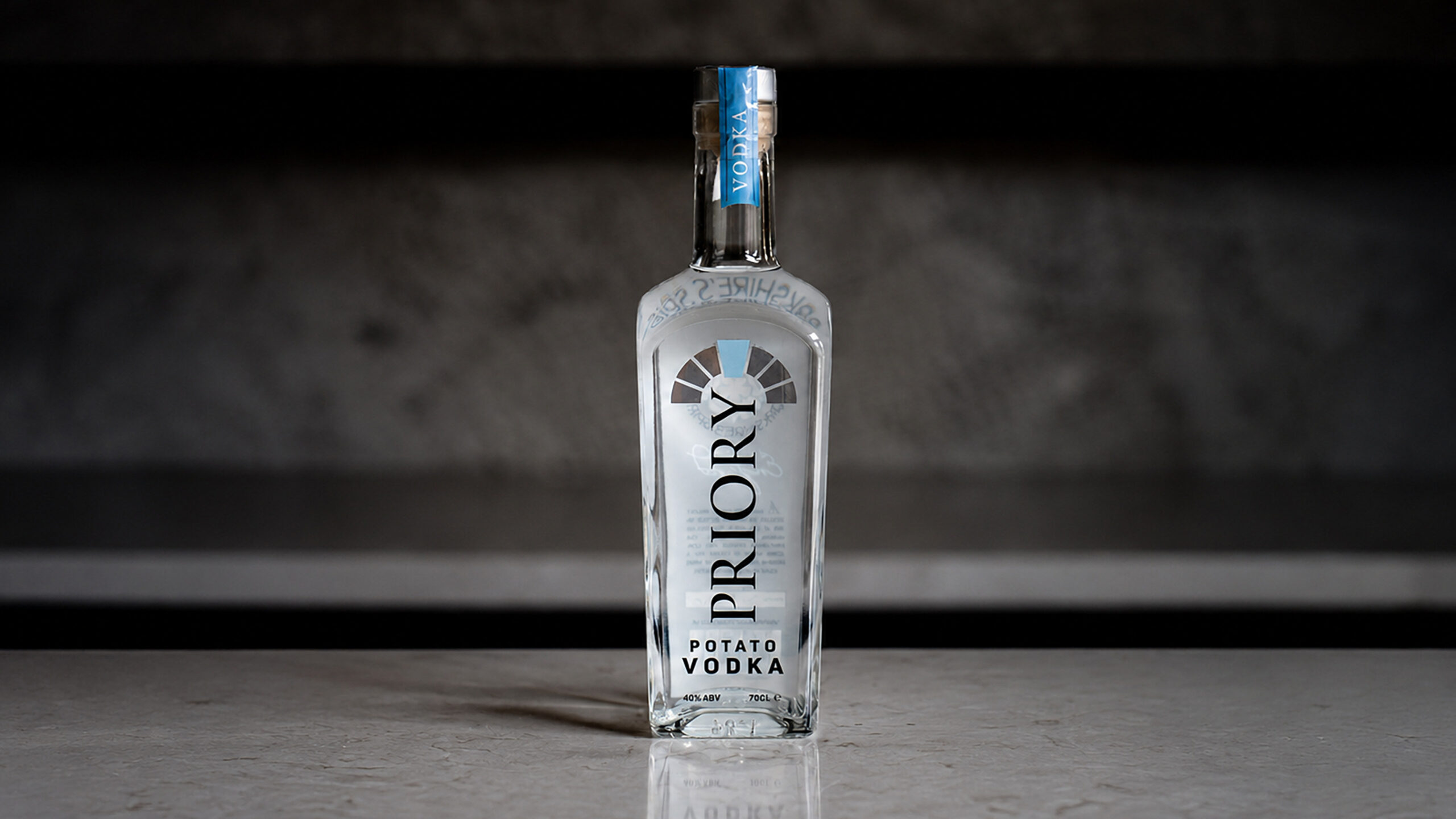
The mark is an arch of blocks over the name. It comes from the Priory itself, a twelfth-century house where nuns once lived, and it works on its own as an icon, in a document or as a profile picture. On the bottle the name runs tall under it, and that tall lockup on a narrow bottle is the constraint everything after it had to fit inside.
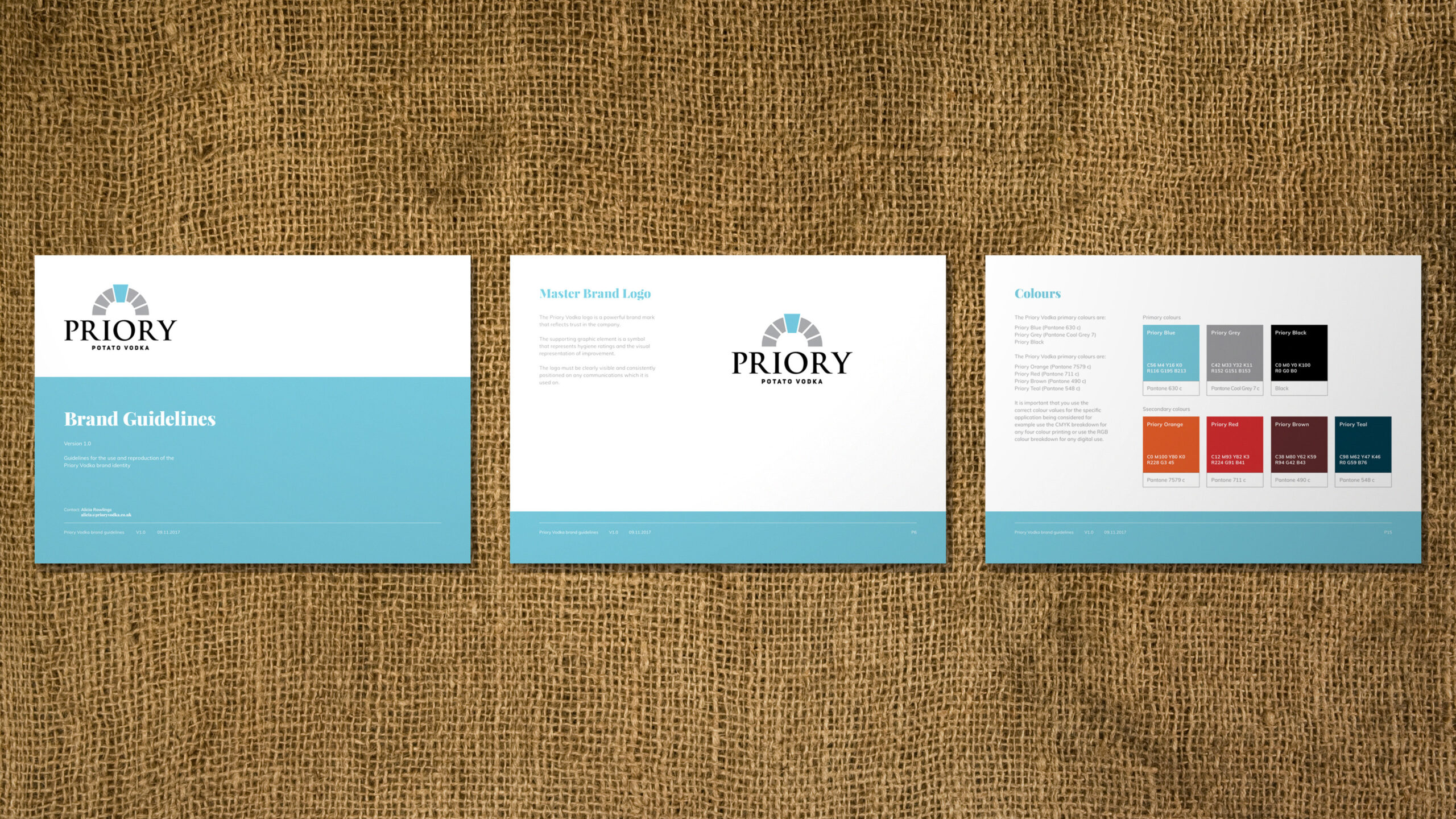
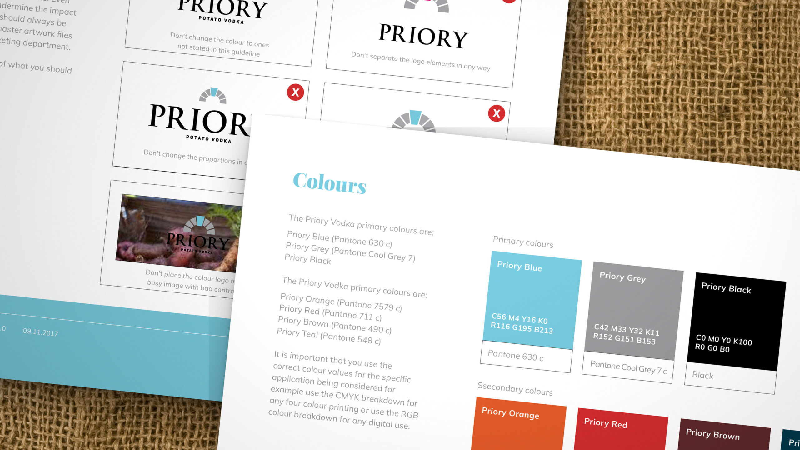
Around it, Priory Blue, a cool grey and black, set in Trajan and Playfair Display. The classical serif gives the brand the age of the building it is named after, and the blue keeps it cool enough for a clear spirit.
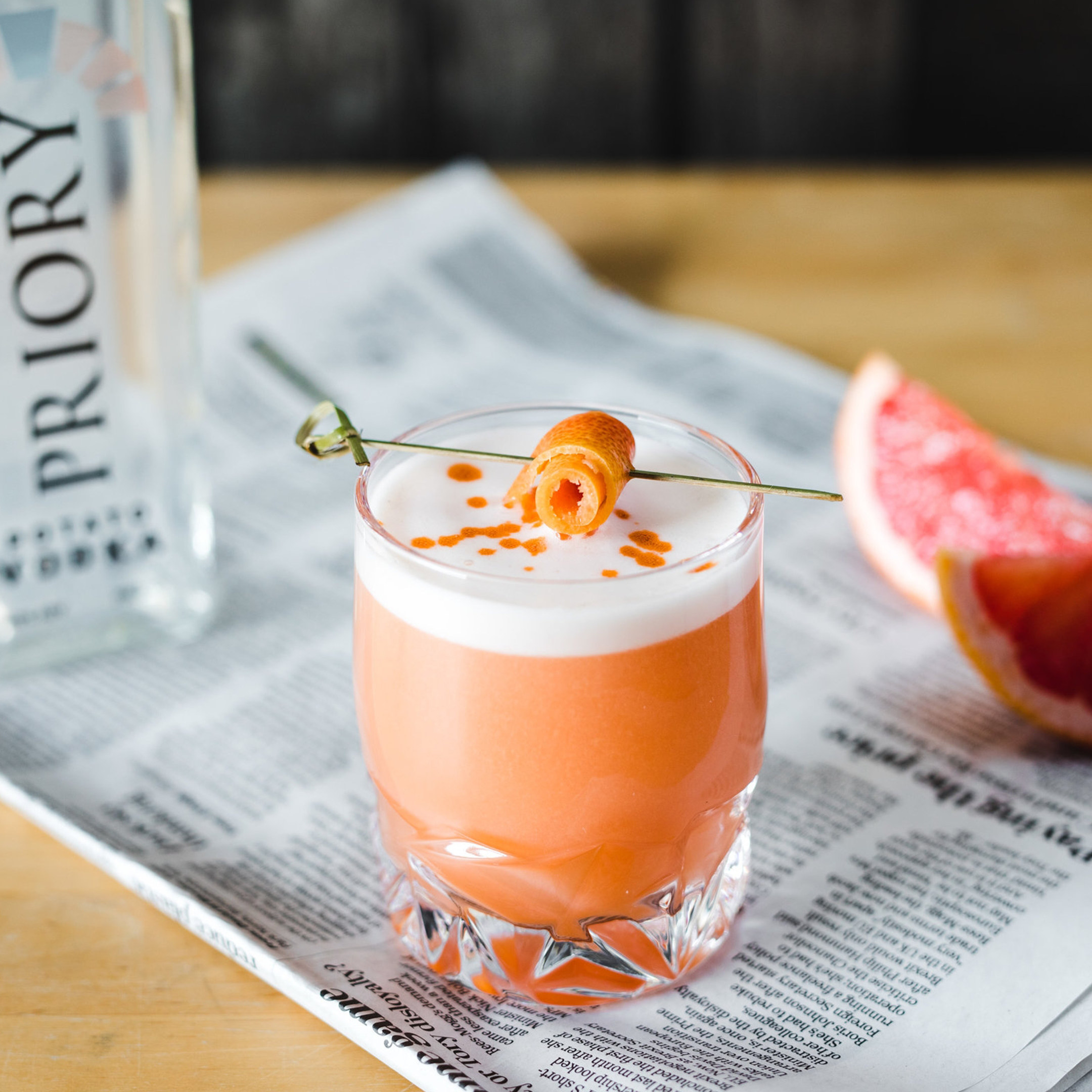
Then the textures to shoot it against: hessian sacks, crate wood and soil from the field, so every photograph has some link to the farm and the product is still what you look at.
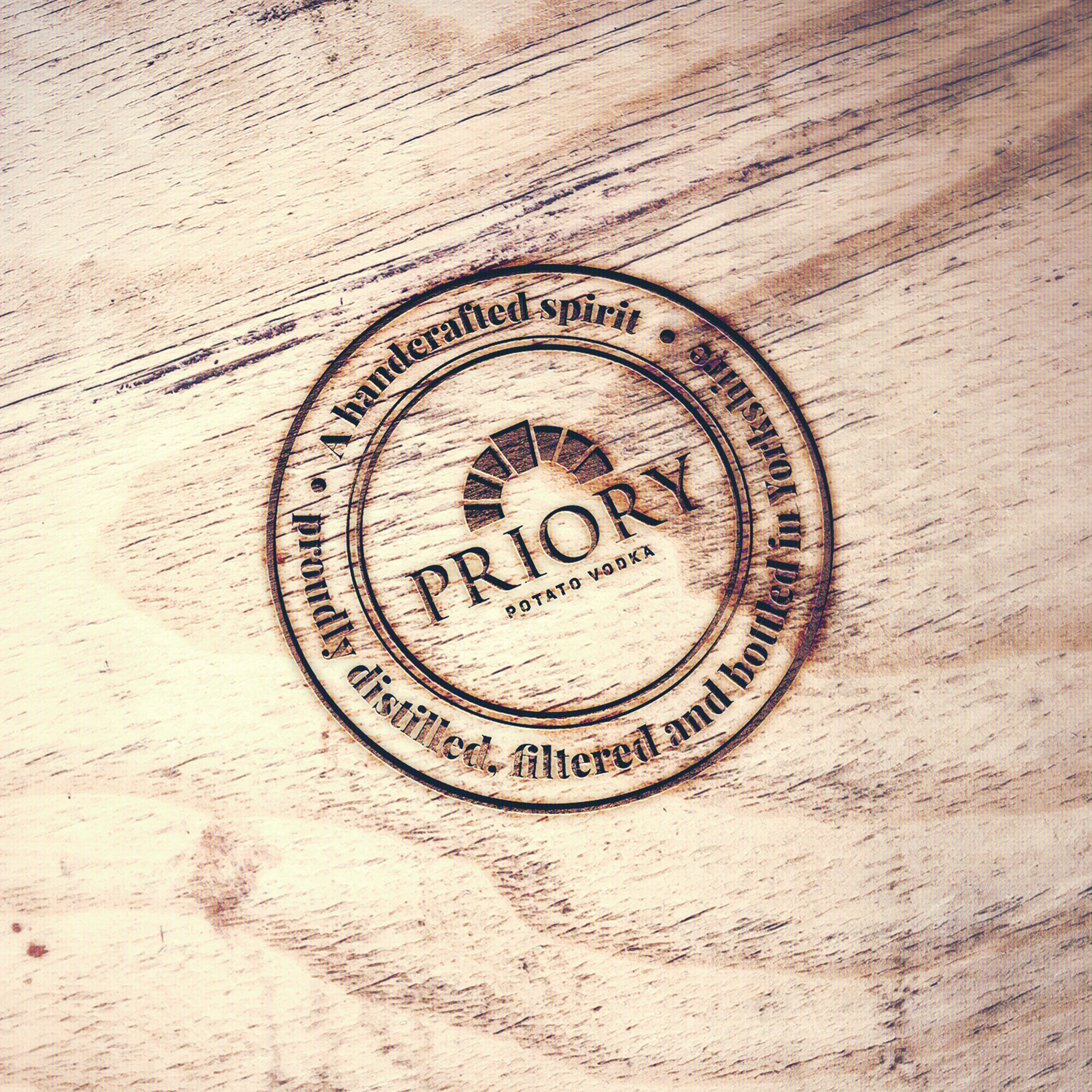
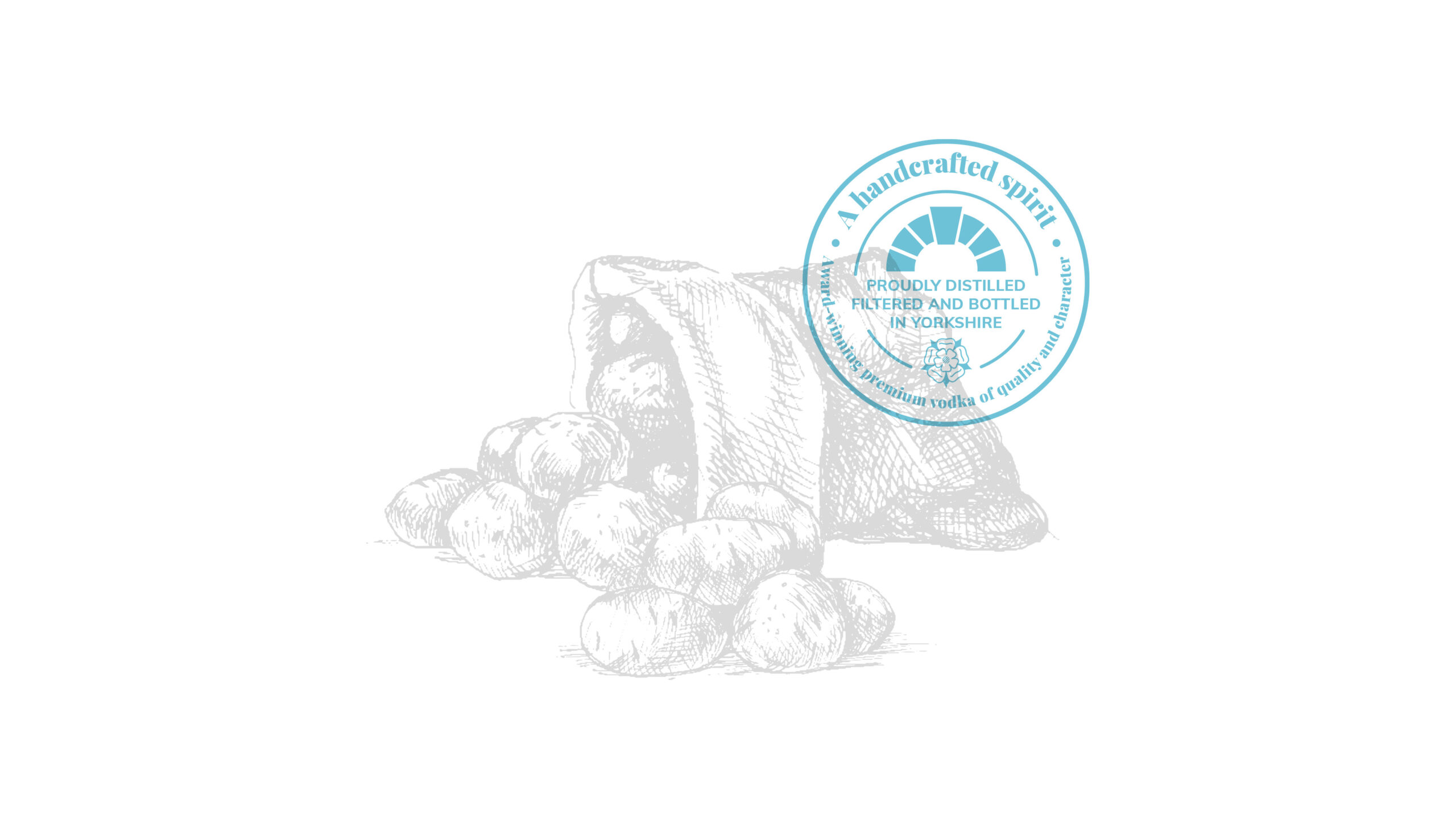
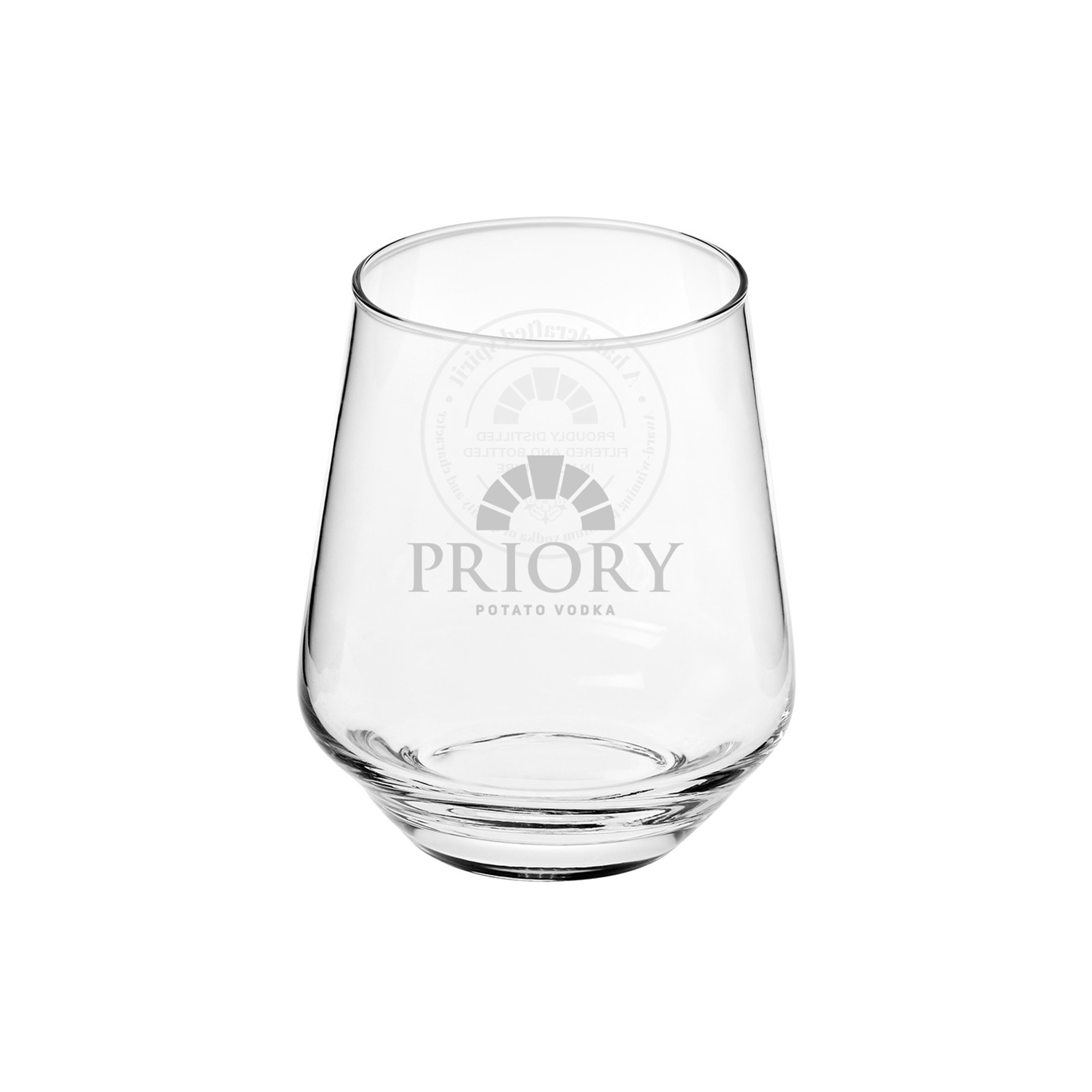
The supporting graphics carry the handmade part. A quality stamp that reads A handcrafted spirit, proudly distilled, filtered and bottled in Yorkshire, and an illustrated potato sack drawn to sit behind it. The stamp works in one colour, so it goes on glass as well as paper.

What was done
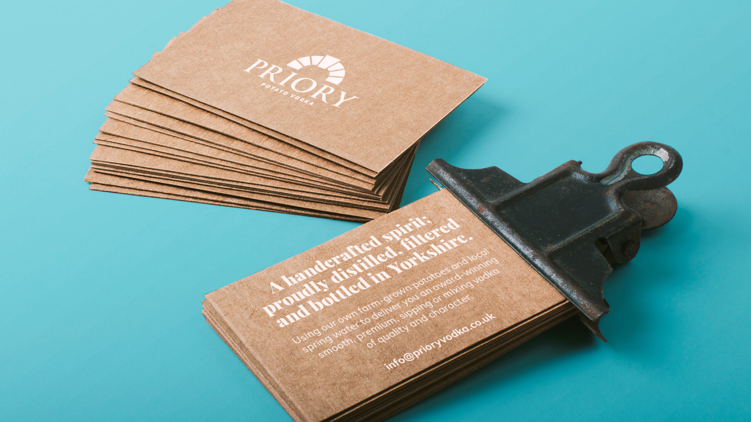
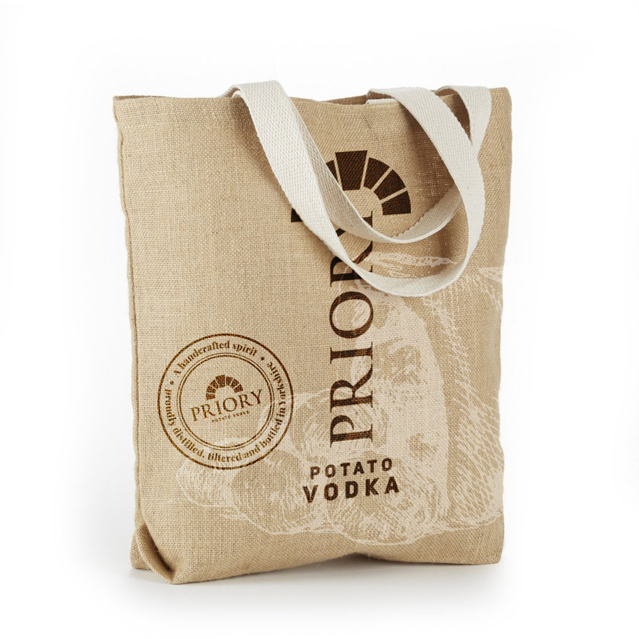
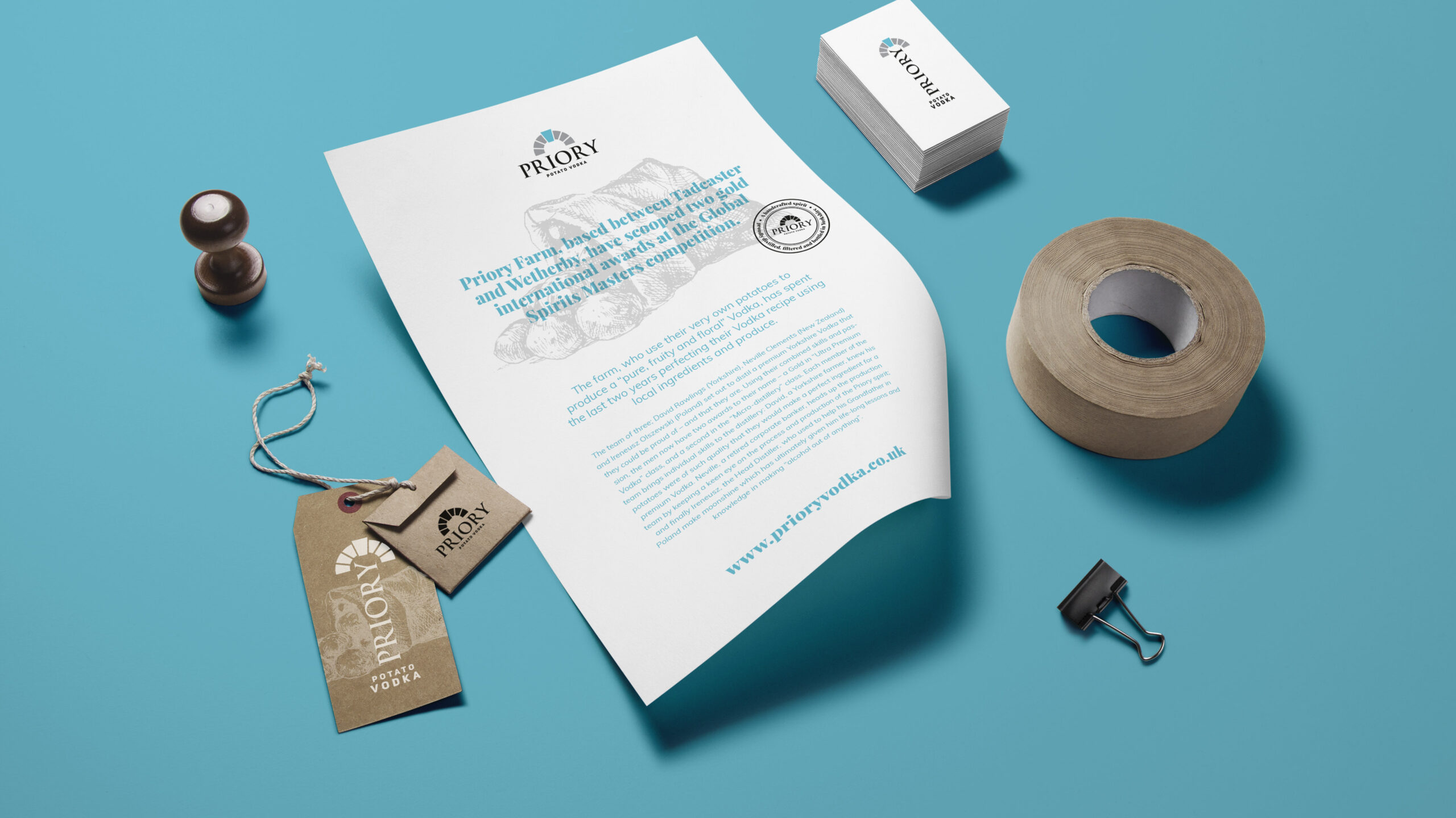
The brand guidelines, version 1.0, set it down so anyone Priory brought in later could apply it without guessing: the mark and its clear space, the colours, the type, and what not to do with any of it. Then the kraft business cards, the letterhead and swing tags, a hessian tote and the stamp pressed into wood.
The real test came when the range grew. The flavoured vodkas had to carry names like Dark Chocolate and Salted Caramel on a label built for one short word, so we tested long text, a different vodka line and lowercase and uppercase back labels before the system was settled. It took sixteen flavours, from Beetroot to Vanilla, each set up for every bottle size down to the miniature.
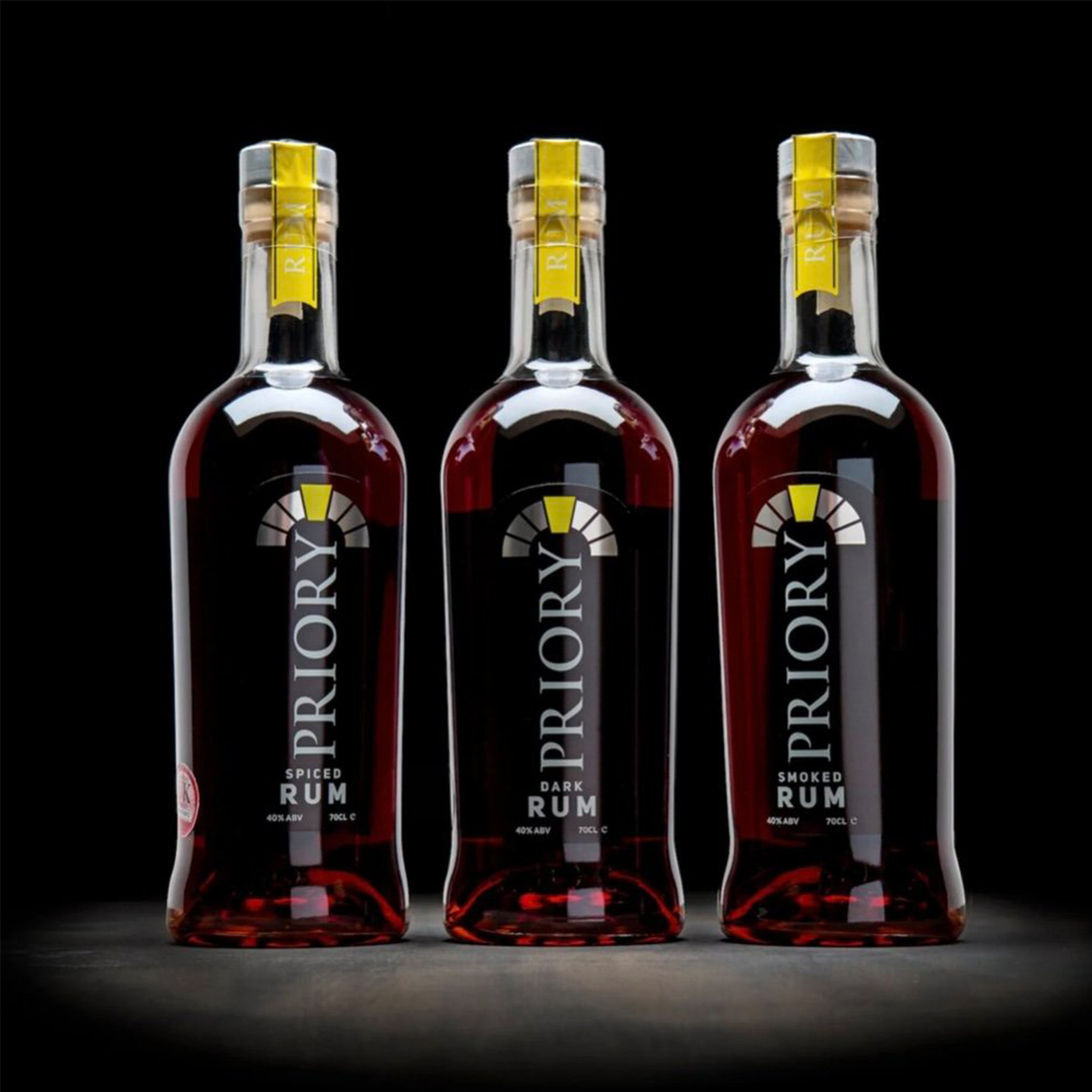
Limoncello, a gift box and cocktails in a can followed. For the cans, Priory asked us to run the logo full width, make it more premium and play with the white space, so the next round went white, with the colour in a band at the base. Then a gin and a rum on the same label system.
Every one of them still carries the arch.