The brief
Gladman came to Crushing looking for a website that felt professional, clean and modern, while helping the business speak to the next generation. But it quickly became clear that the website needed a stronger brand behind it, with brand guidelines to hold it together.
The existing identity was showing its age. The wordmark felt dated and overly formal, while the graphic mark featured an old scripted G and elements that had not been drawn with real consistency. Squares did not quite align, proportions varied, and there were no usable vector versions or master artwork to build from. It made the brand difficult to apply accurately and almost impossible to evolve with confidence.
That mattered because Gladman operates in a space where trust is everything. They promote strategic land through the planning system, speaking to landowners who are deciding whether to put their land in Gladman’s hands, and planning authorities considering whether proposals should move forward. Both audiences need reassurance, clarity and professionalism from the very first interaction.
The brief therefore grew beyond a new website. Crushing was asked to create a clearer, more credible and more flexible brand identity, one that could bring consistency to every touchpoint and give Gladman the confidence to communicate with both established and future audiences.
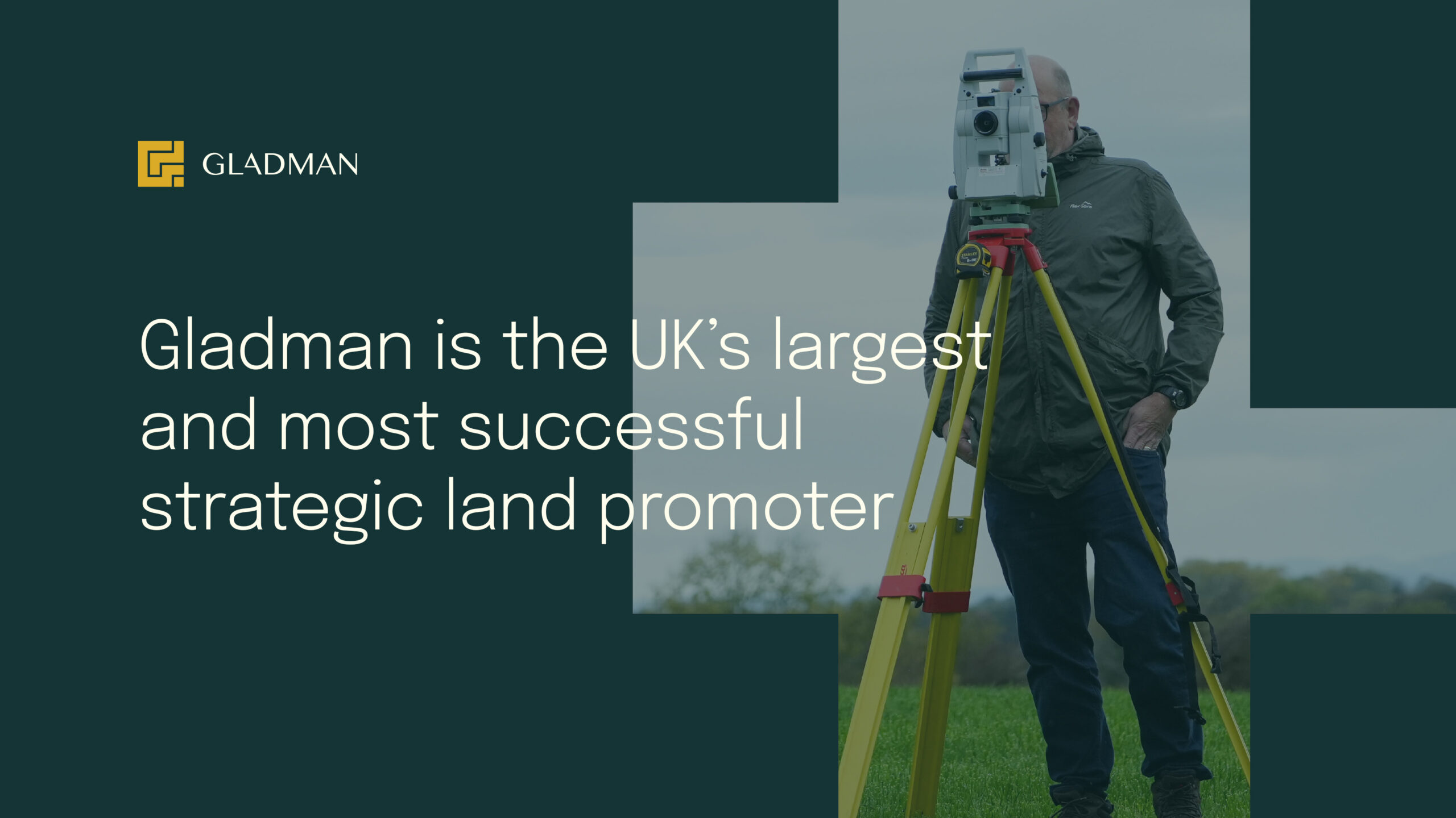
The approach
Before designing the website, we needed to give the identity a stronger foundation. Redrawing the existing mark brought its issues into focus. The squares did not quite line up, the scripted G felt dated, and the whole thing lacked the precision Gladman wanted to be known for. Rather than throw it all away, we treated the project as an evolution, keeping hold of the details that still felt recognisable and worth preserving.
We began with the wordmark, making it cleaner and more contemporary while retaining the cut away detail from the original A. It was a small but distinctive feature, so it gave the new identity a clear link back to the old one without holding it there.
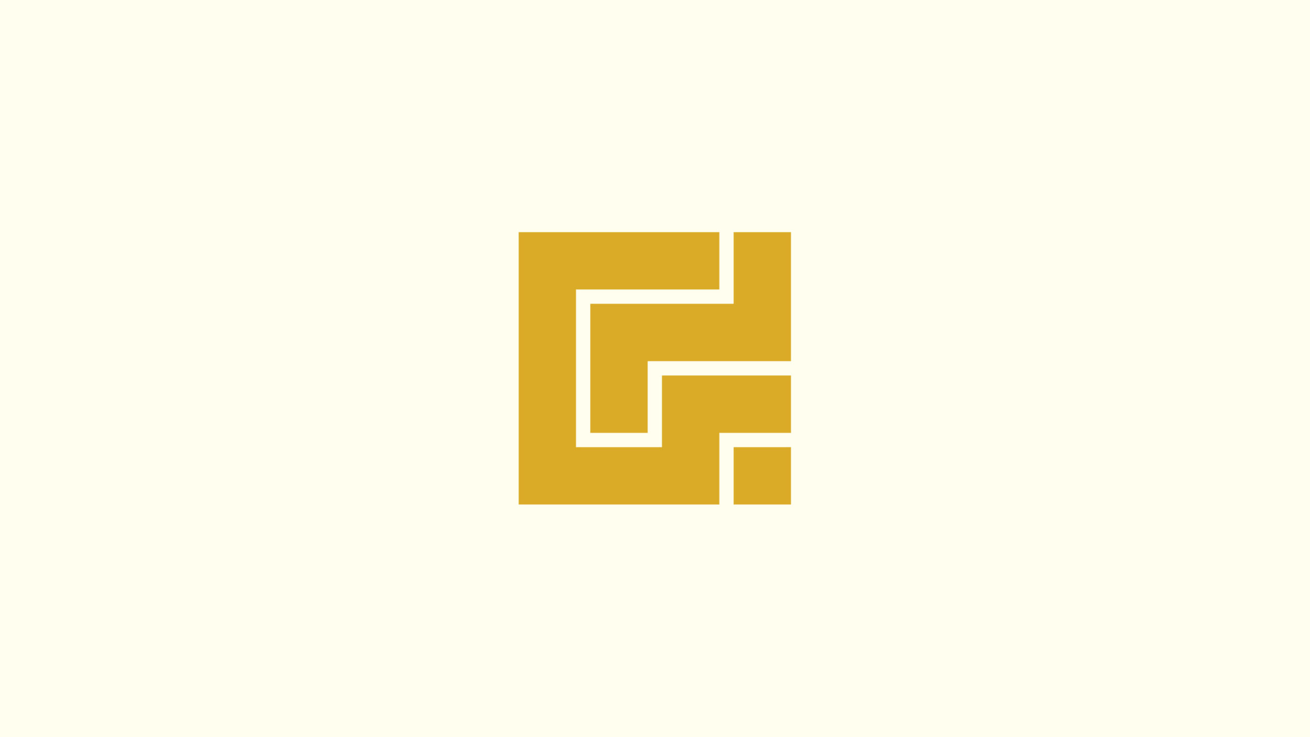
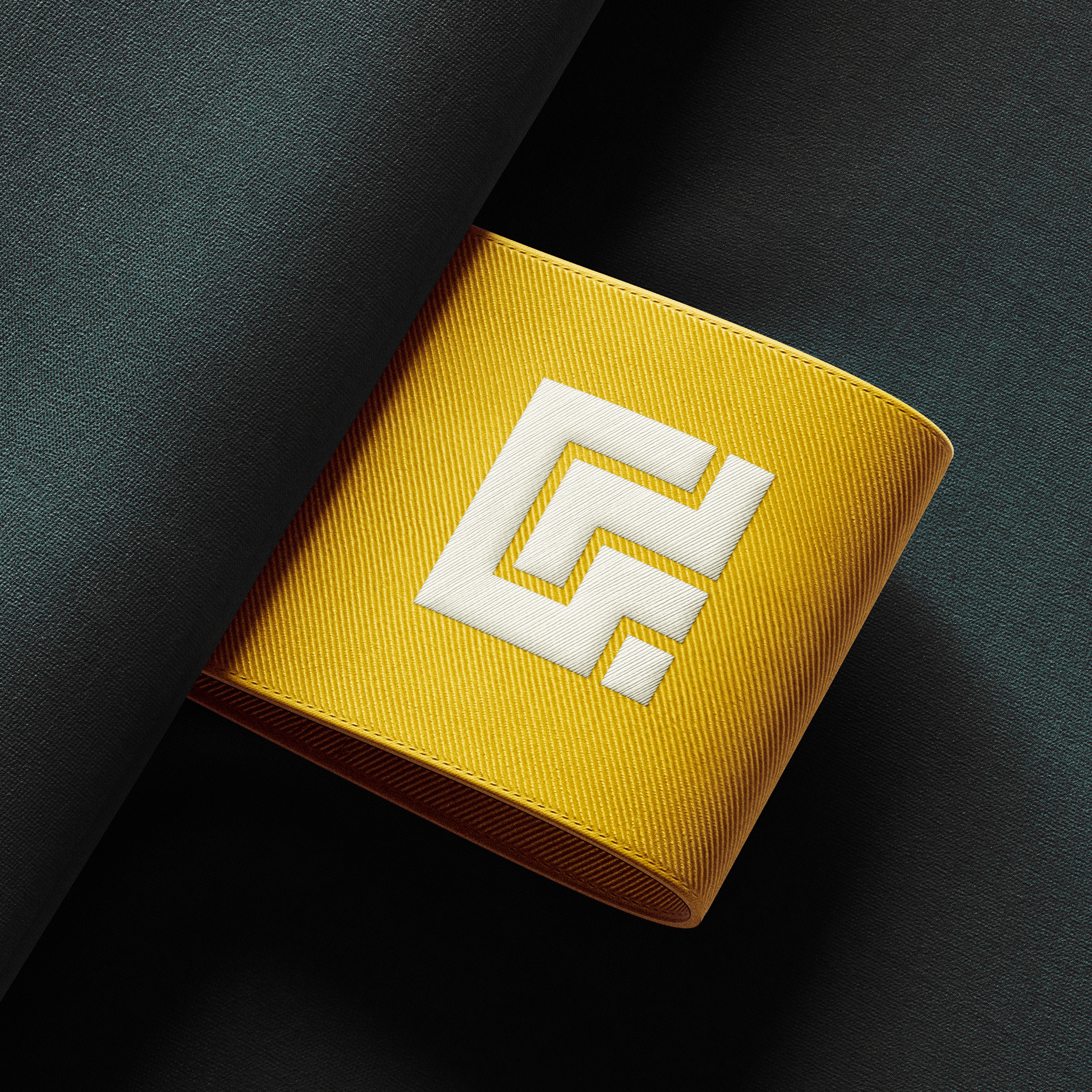
From there, we explored three routes for the graphic mark. One refined the existing square grid, one took its cues from land registry plans and the boundary lines Gladman works with every day, and one built a north arrow into the A of the wordmark, a familiar symbol on planning drawings. Gladman chose the boundary route because it came directly from the world they work in. The final G is built from those plan lines, giving the mark a clearer purpose, a stronger sense of place and a more precise way of representing the business.
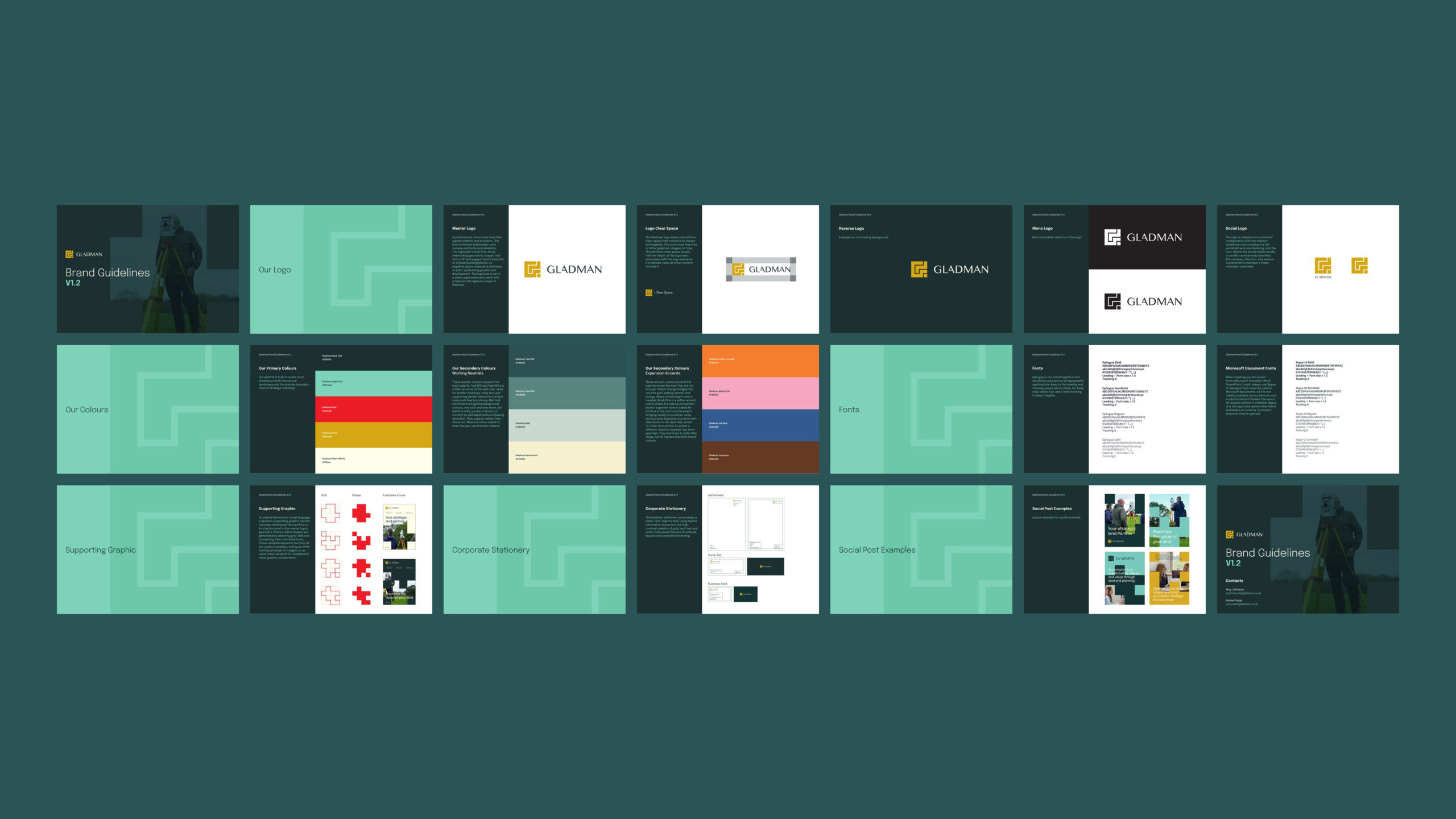
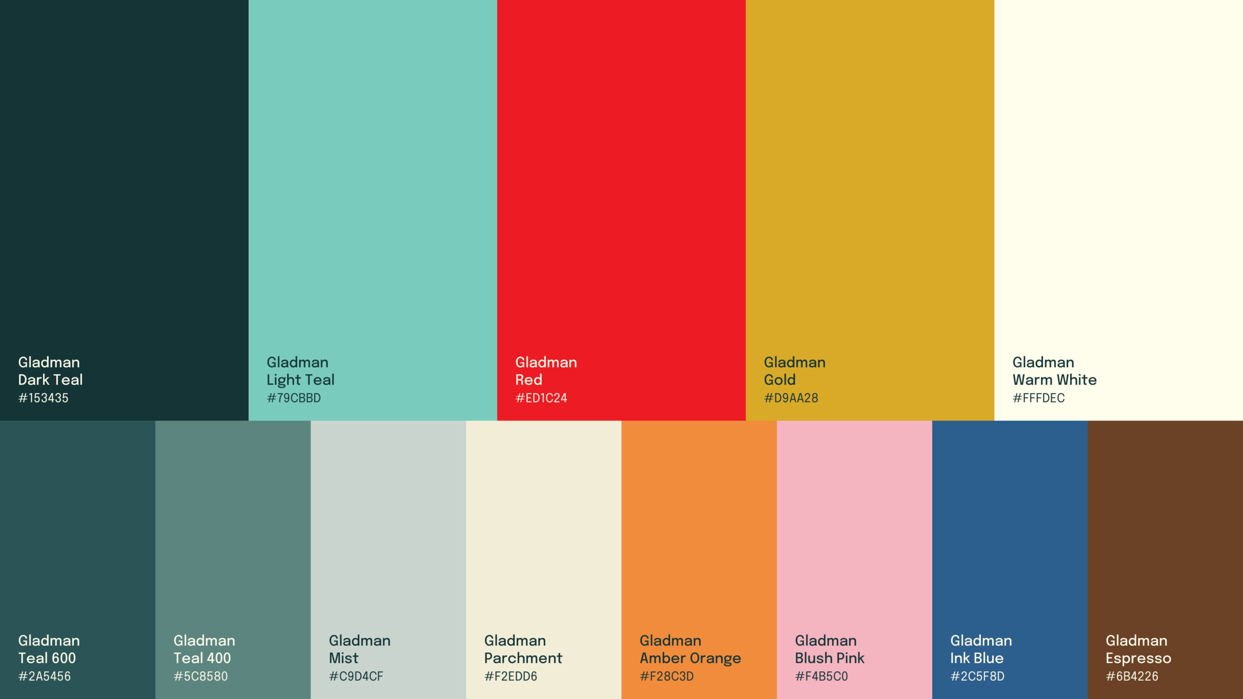
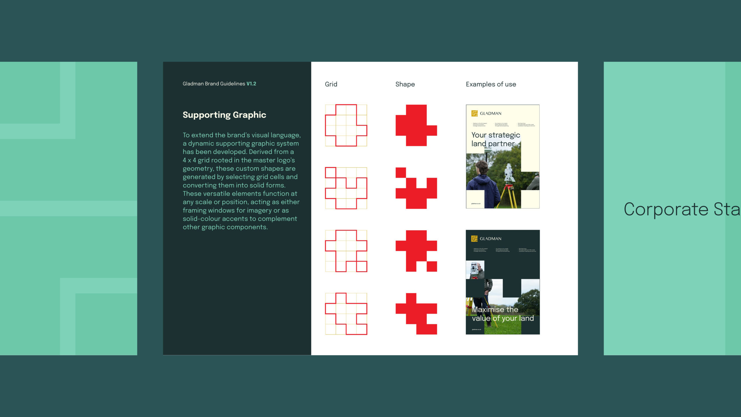
We then built the system around it. The brand guidelines set out how the identity works across colour, typography and supporting graphics, giving the team a clear reference point for applying the brand consistently. Epilogue is used where it can be installed, while Segoe UI keeps everyday documents in Word, PowerPoint and Excel reliable and easy to share. It is a practical choice that means the brand can stay consistent in the real world, not just in the design files.
What was done
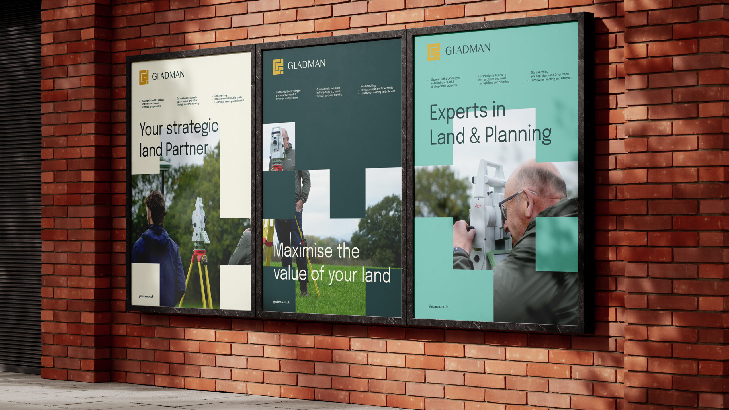
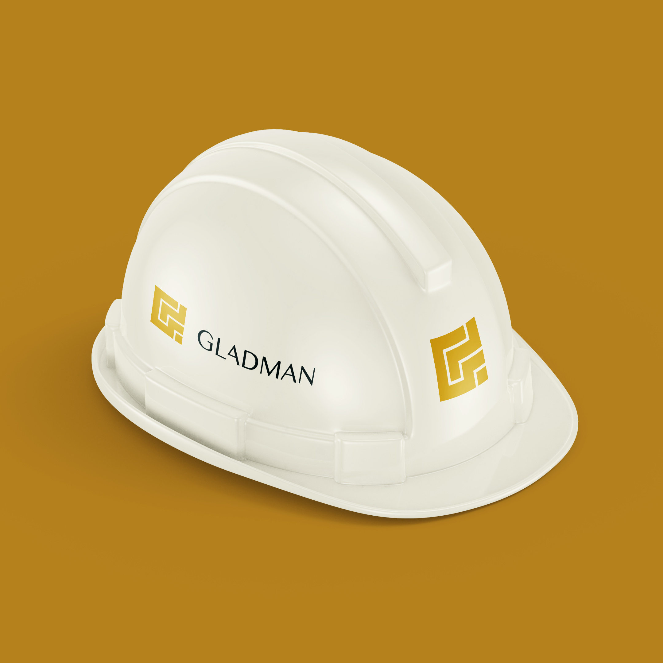
Crushing created a complete identity system that gives Gladman a clearer, more confident way to show up. It started with the new mark and extended into a twenty one page set of brand guidelines, setting out the foundations for how the brand should look, sound and work across every touchpoint.
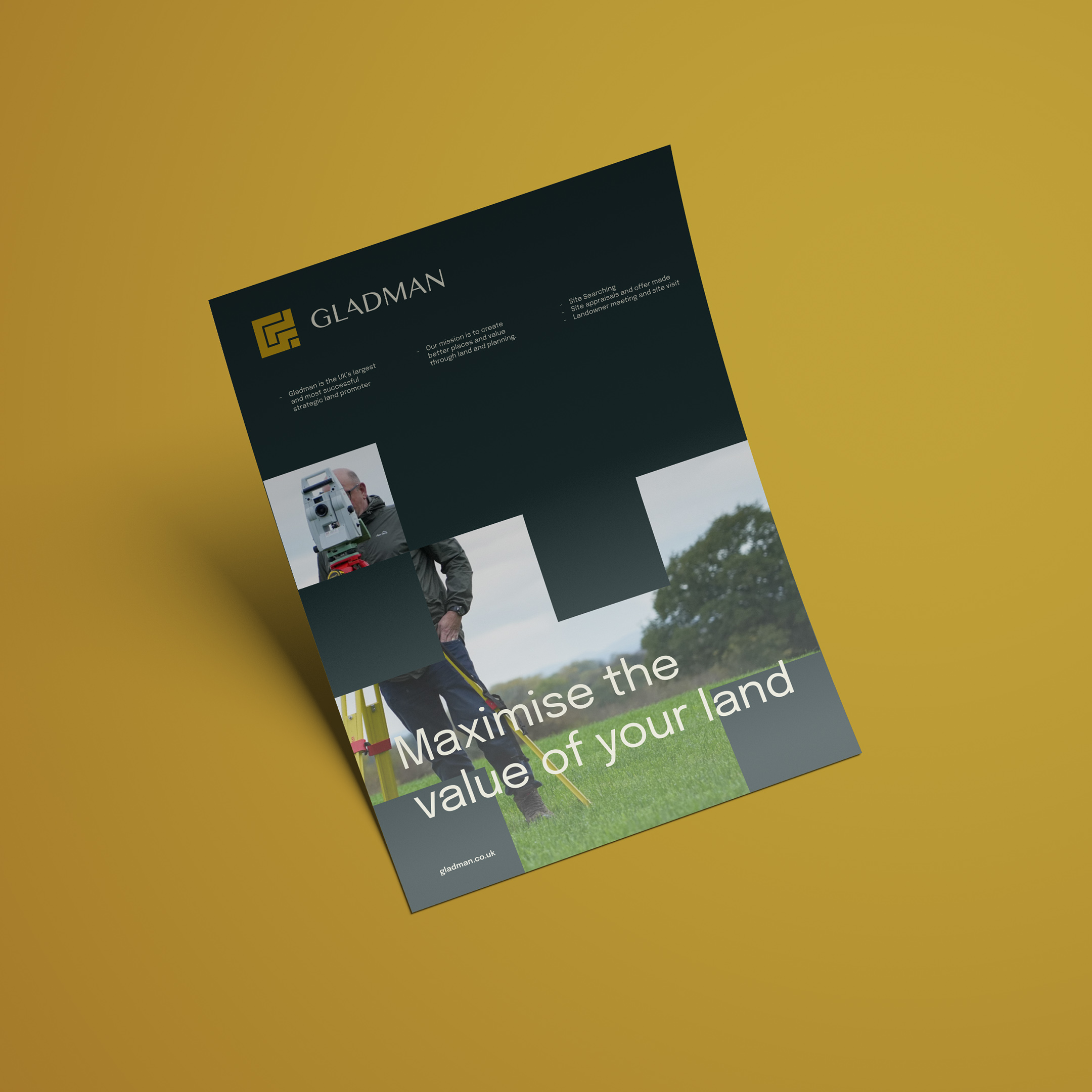
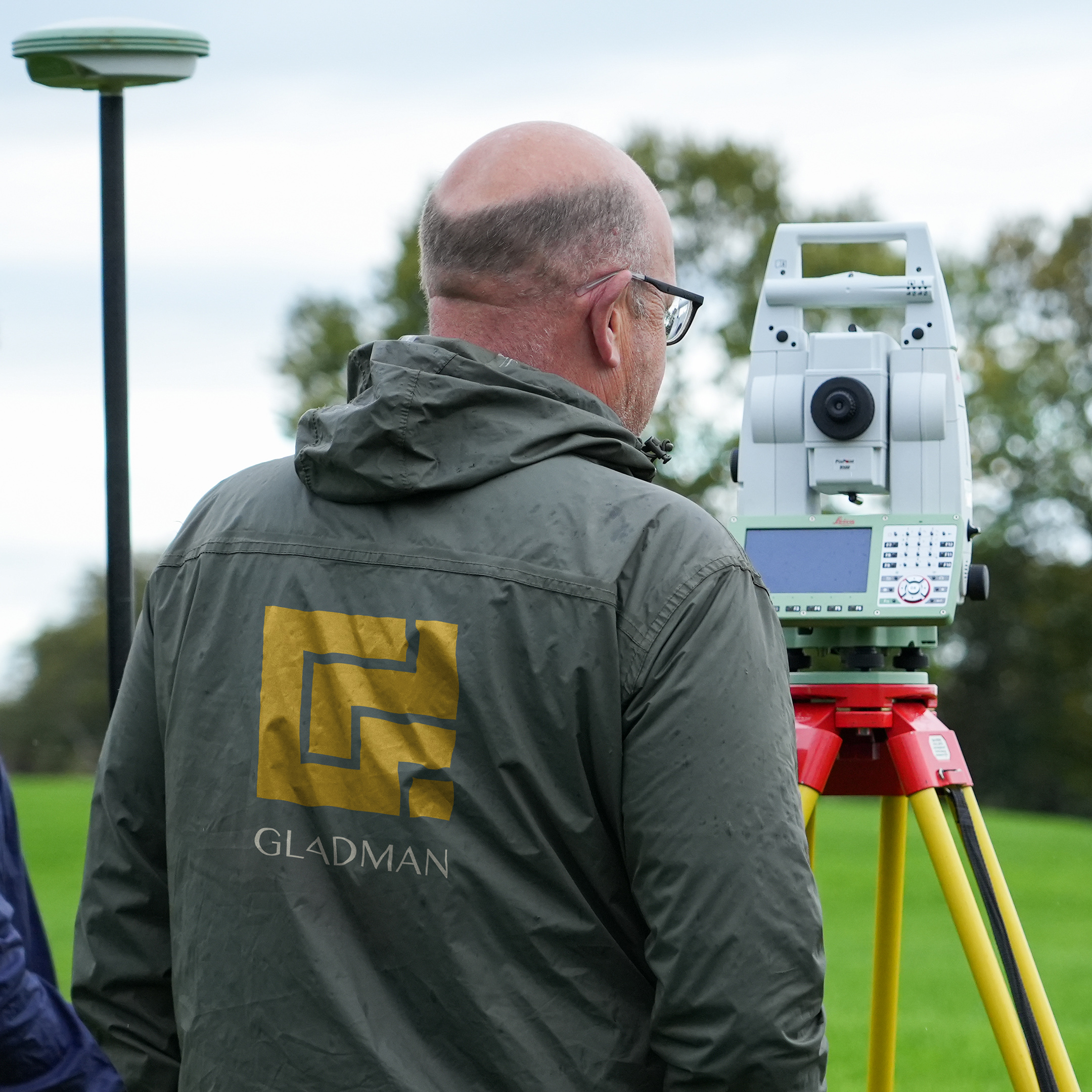
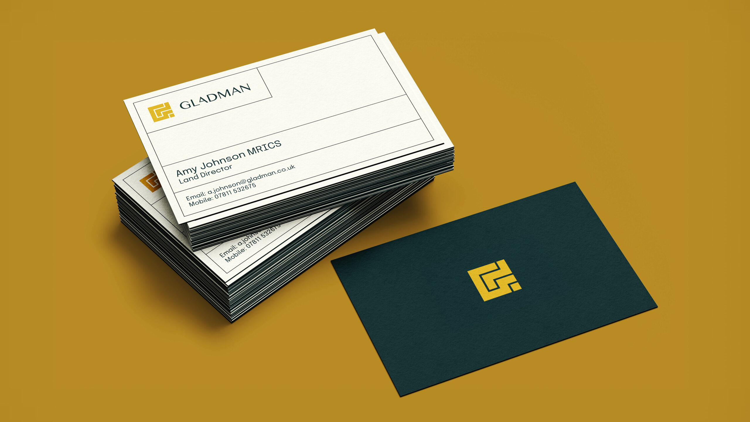
We then brought the identity into the everyday materials Gladman relies on. This included letterheads, business cards created from the team’s own staff list, compliments slips, drawing blocks and a Have Your Say leaflet for public consultations. Each piece was designed to feel practical, considered and unmistakably Gladman.
To make the system easy to use, the guidelines now live online, giving the team one simple place to find what they need. We also created a broad range of templates for social content, internal documents and day to day communications, giving people the tools to create consistent work without having to start from scratch each time.
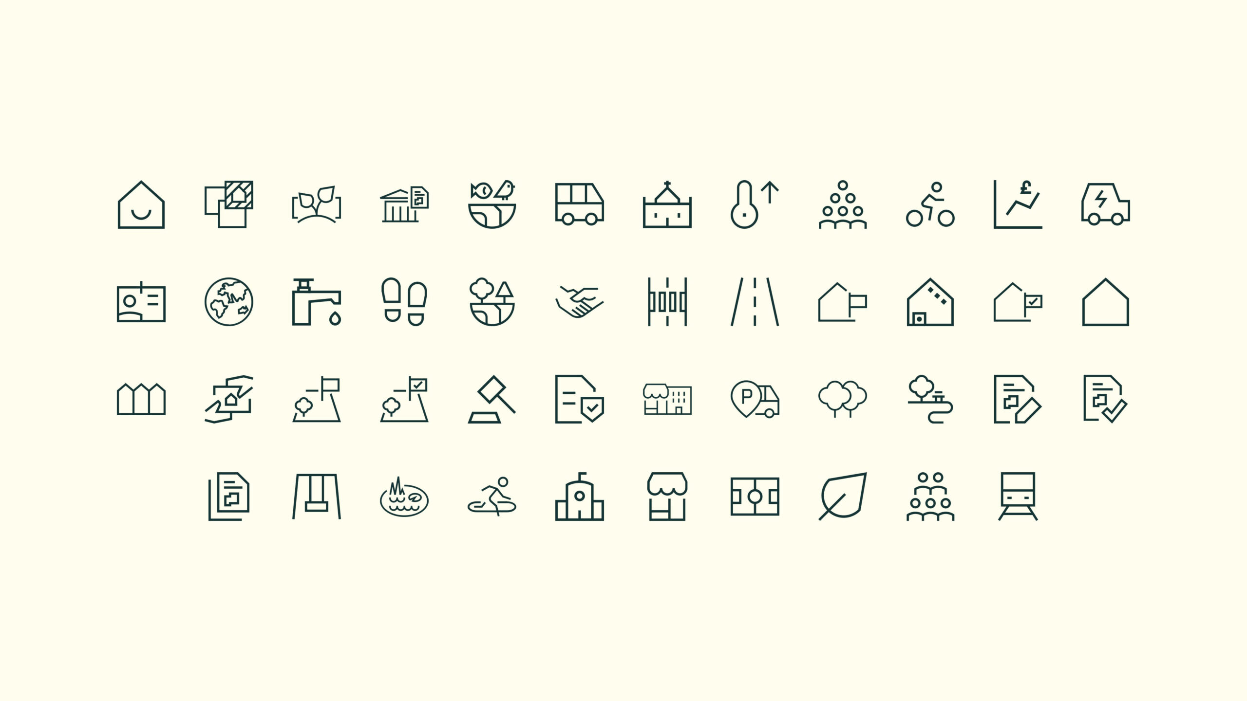
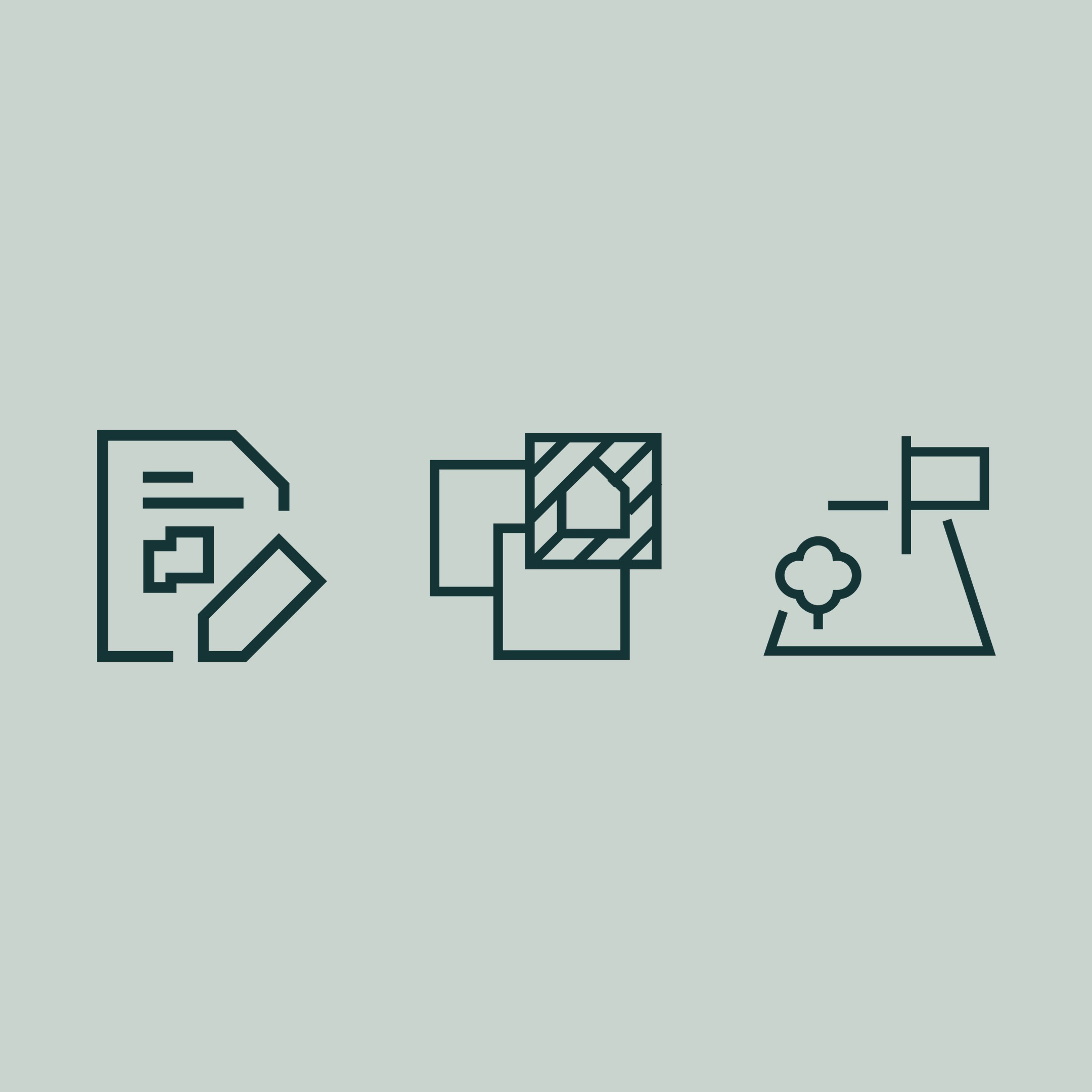
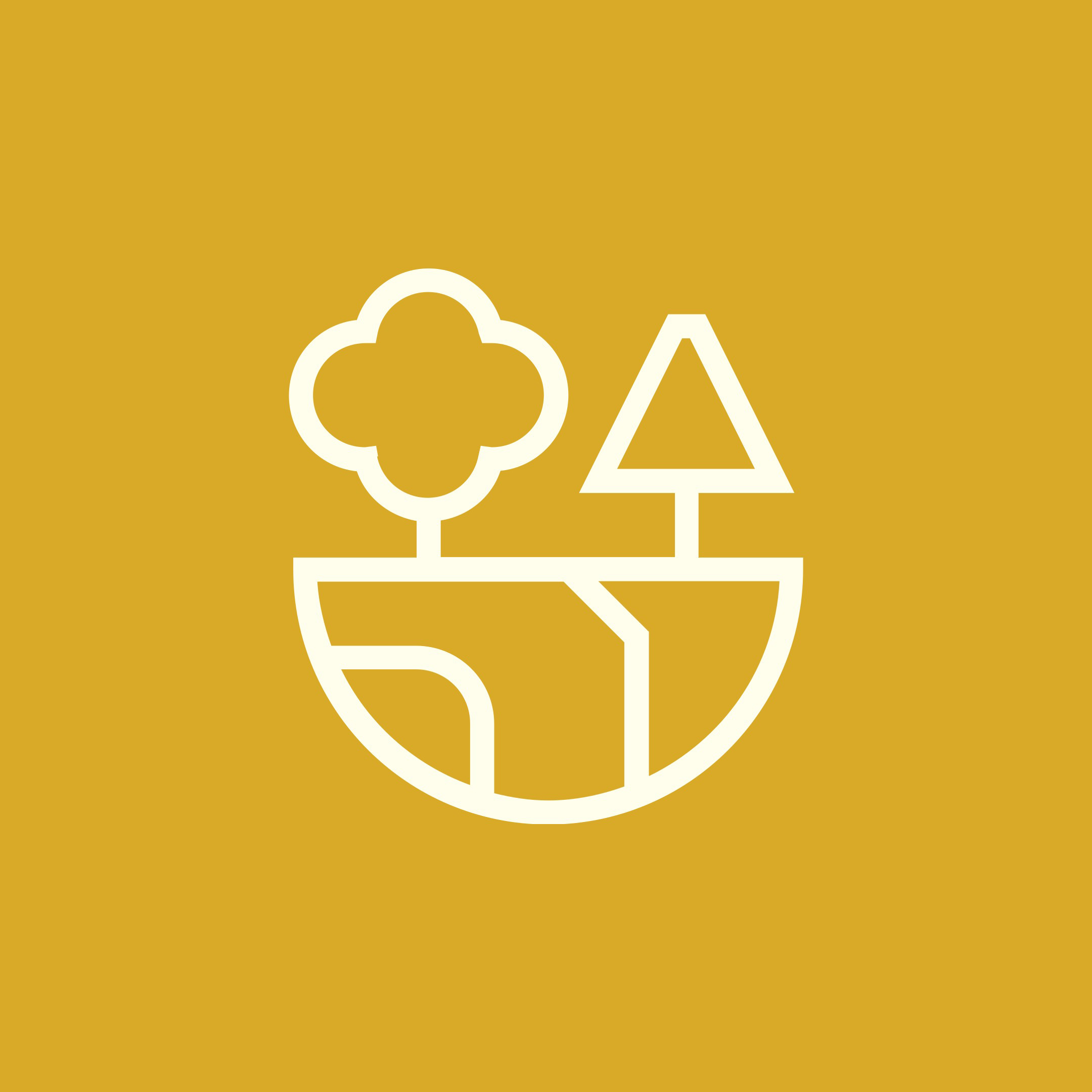
A bespoke icon set adds another useful layer to the identity. Covering topics such as homes, communities, planning, transport and sustainability, the icons help turn often complex information into something clear and easy to understand.
Crushing is now Gladman’s brand guardian, helping the identity stay consistent as it grows and evolves. Our role is to make sure the brand continues to work in the real world, supporting the team with the guidance, tools and creative input they need to keep Gladman looking and sounding like Gladman.