The brief
SOS Interiors & Gifts is an independent interiors and gifts shop trading as Smiths of Scotland. The brief in October 2023 was four words, timeless, classic, quality and premium, and one instruction: evolve the brand, do not replace it.
The logo was a Celtic knot sat over SOS Interiors & Gifts, gold on black. We put the problems on the fourth slide rather than working round them: the marque felt dated, the colours had washed out to a flat yellow, the serif was dated too, and the knot itself was too busy to hold together at the size a shop sign gets read at.


The approach
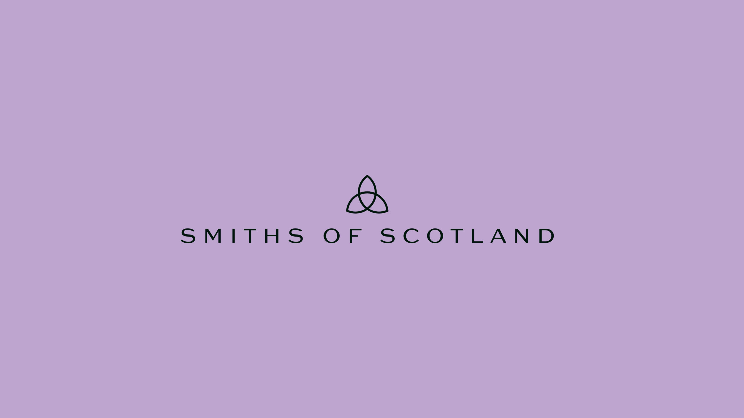
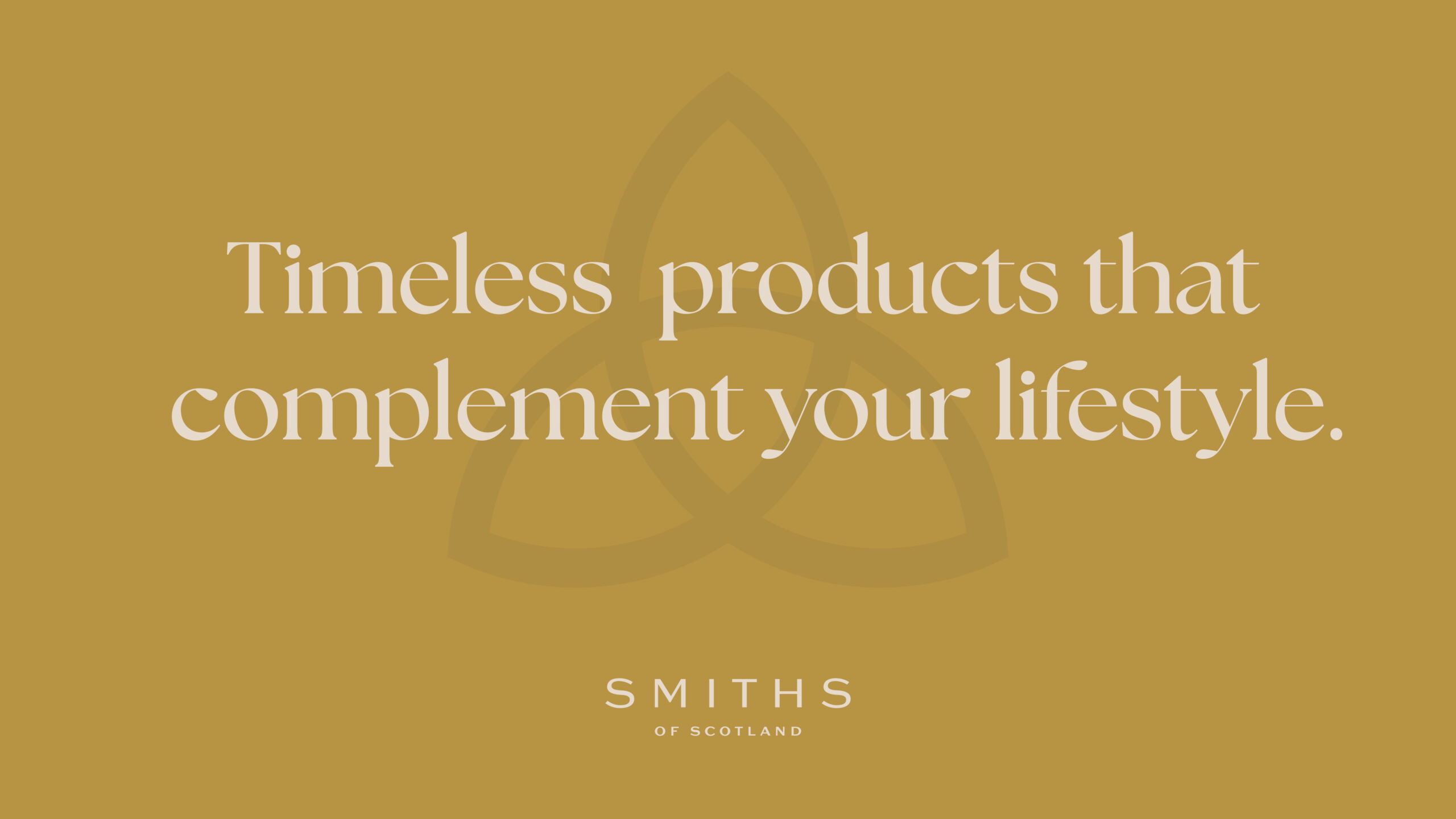
Evolve, not replace, meant the knot had to stay. So it was redrawn rather than dropped: the same triquetra, the interlace opened out, one clean line where there had been a tangle. Anyone who knew the old sign still knows this one, and now it holds together at the size a hanging sign is read at.
Then the name and the type. The mark now says Smiths of Scotland, which is what the business is called, and the gold serif gives way to a letterspaced sans. Four were tried before it was settled.
The old palette was black and a gold that had drifted to yellow. The new one did not need inventing. Smiths of Scotland has a family tartan, and the deep green, the gold, the lilac and the cream are all sitting in it. We pulled them out and gave them proportions.
What was done
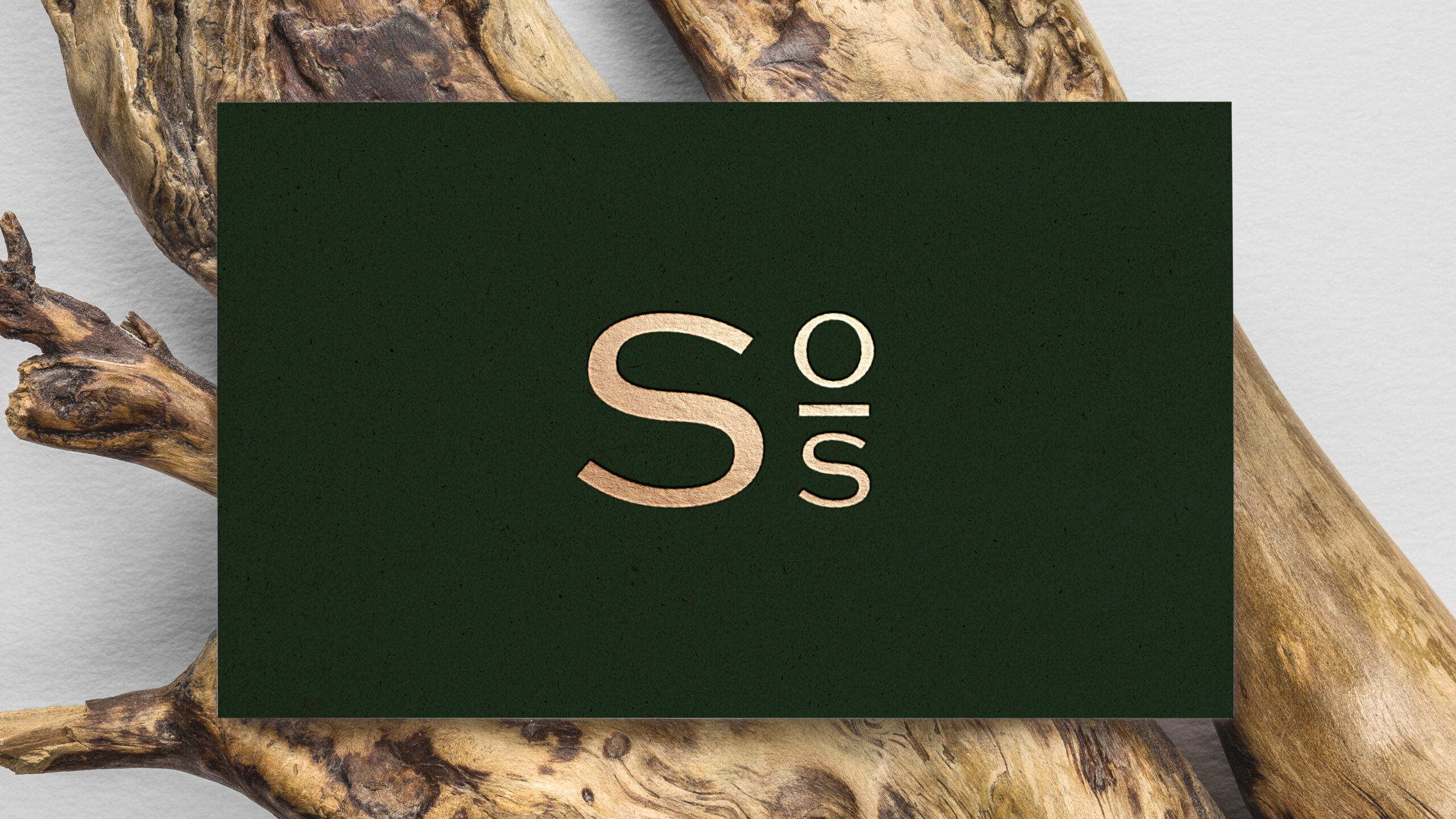
Smiths above, of Scotland beneath, letterspaced, with the redrawn knot. It runs as a full lockup, as the knot on its own, as a watermark where the background is doing the work, and as an S os monogram for the places a full name will never fit, like a door or the back of a card.

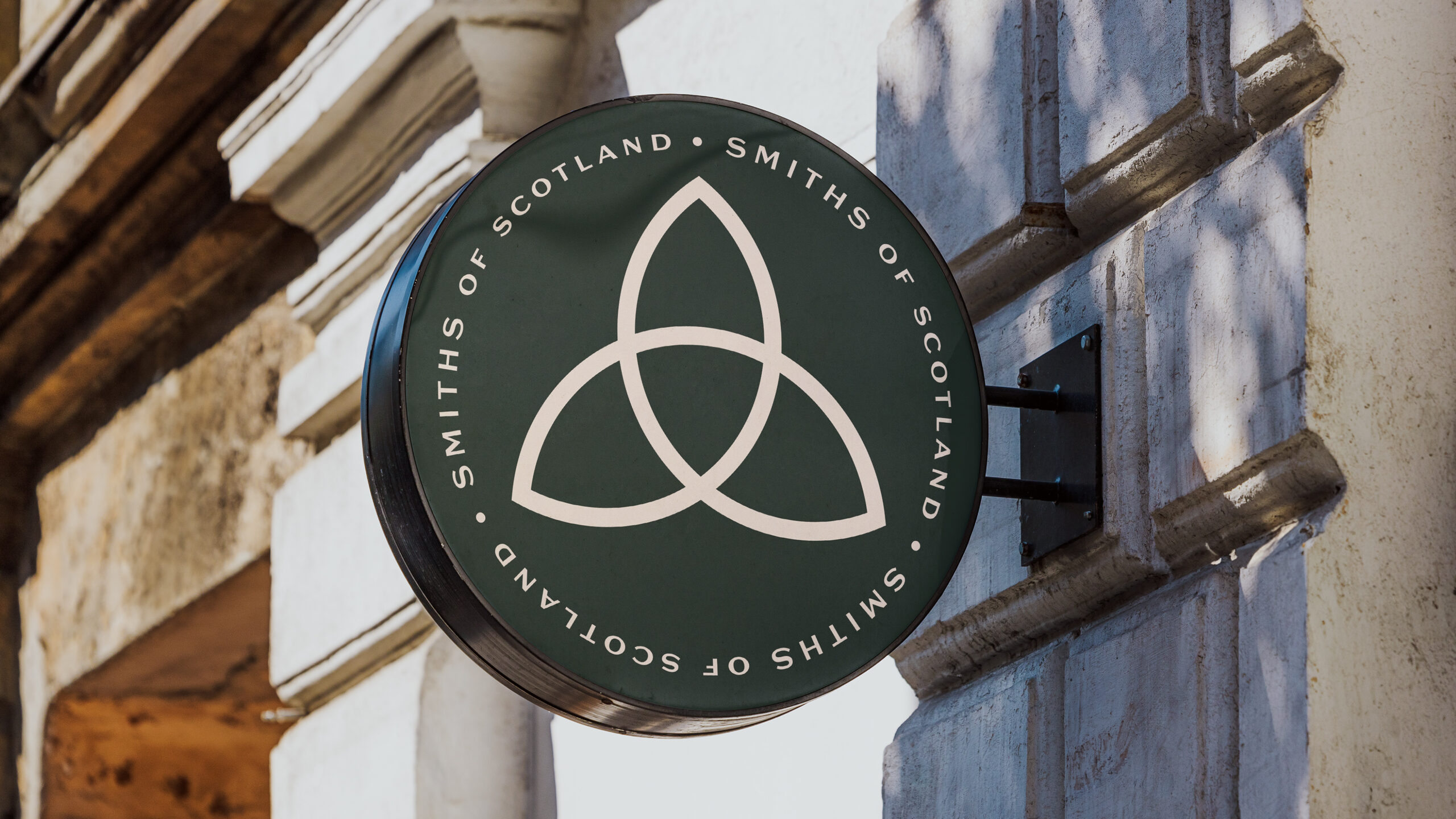
29a is a stone shopfront on a corner. We photographed it and drew the brand onto it two ways, a full takeover and a cheaper sign-only route, so the budget conversation could start with both ends in view. Both keep the same round hanging sign: the redrawn knot inside the name, cream on green, at the size the old knot fell apart at.
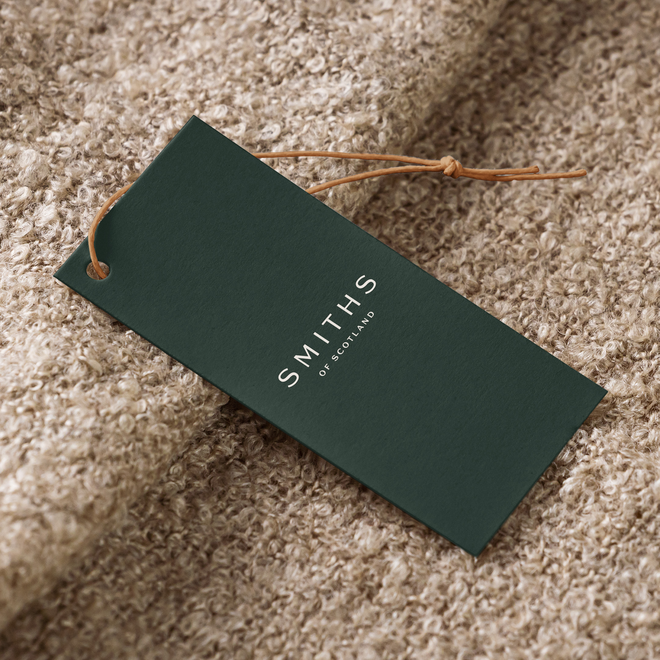
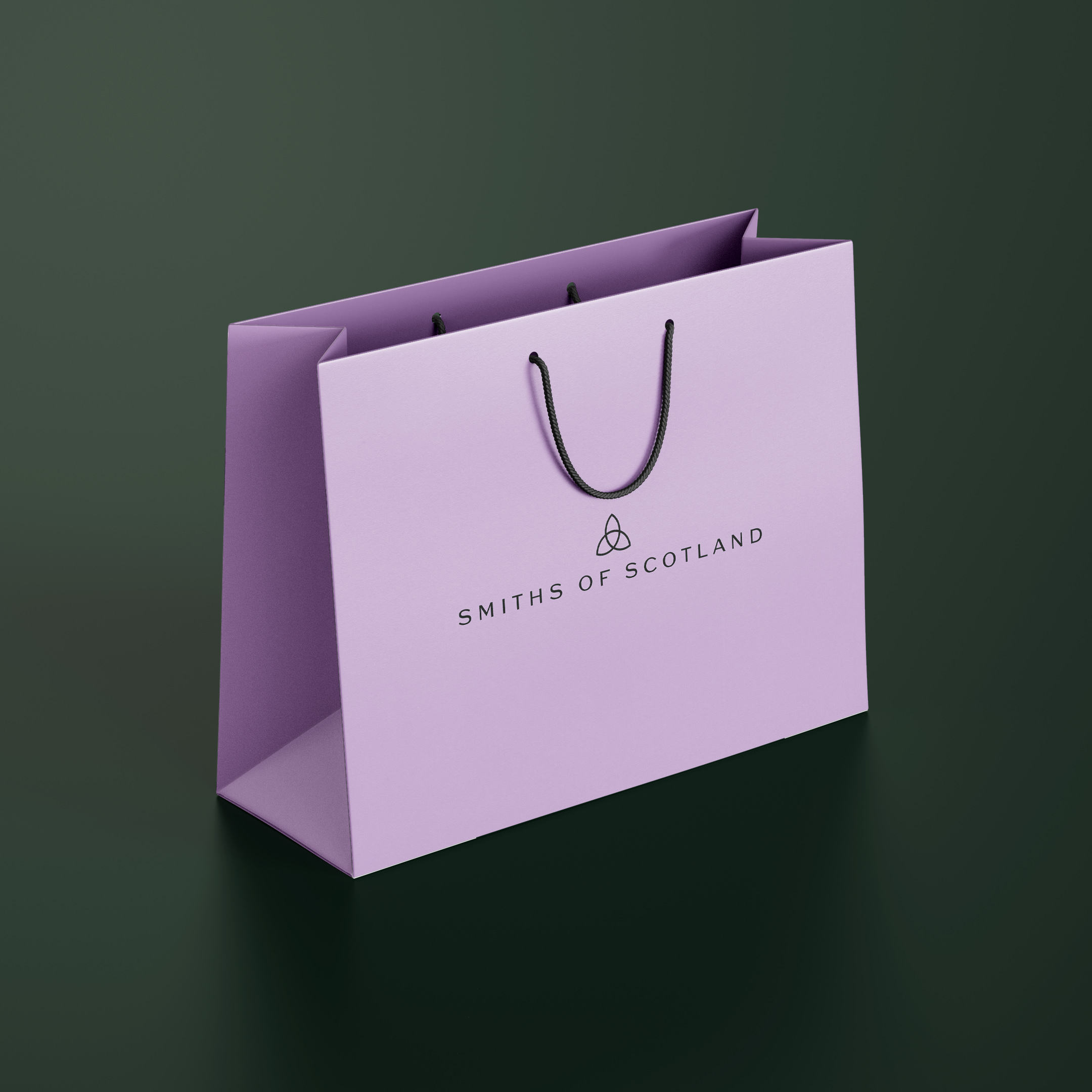
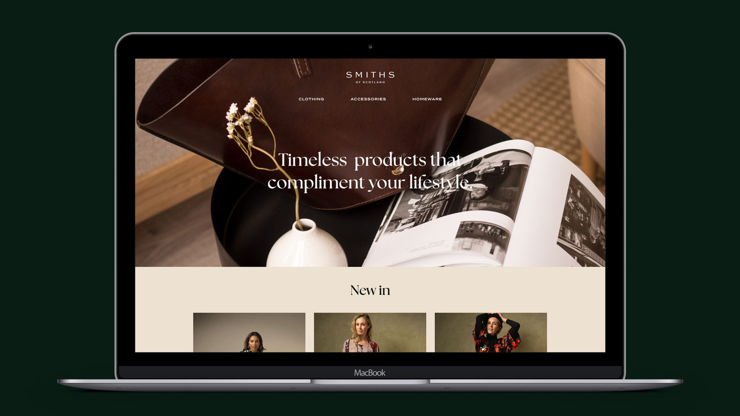
Then the things a customer goes home holding. The business card, with the monogram gold foiled on the back. A clothing tag in the green with a leather tie. A lilac shopping bag with the name across it. The homepage was drawn as an example of where the brand goes next; it has not been built yet.