The brief
Locala Health & Wellbeing is a community interest company running NHS and local authority health services across West Yorkshire and Greater Manchester. In February 2017 we were looking at their website, and it was clear the brand underneath was not going to hold it up.
The approach
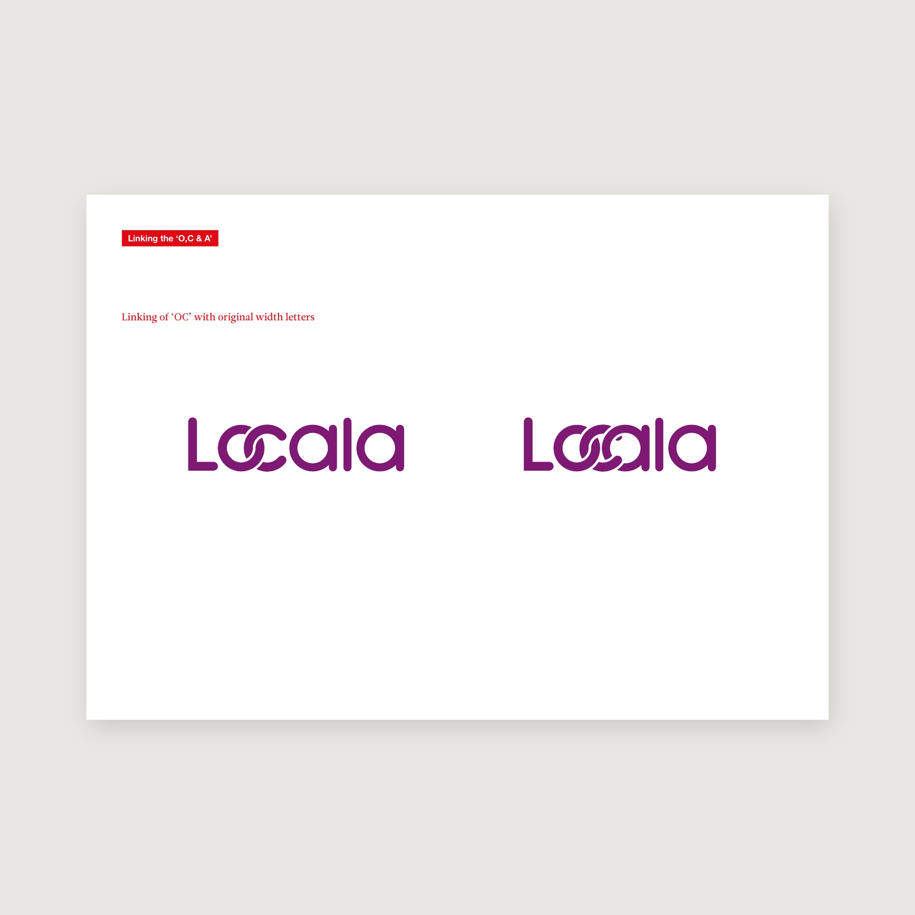
So we drew an idea for the mark: the o and the c of Locala linked together, for an organisation whose full name was Locala Community Partnerships. We drew one. They took it.
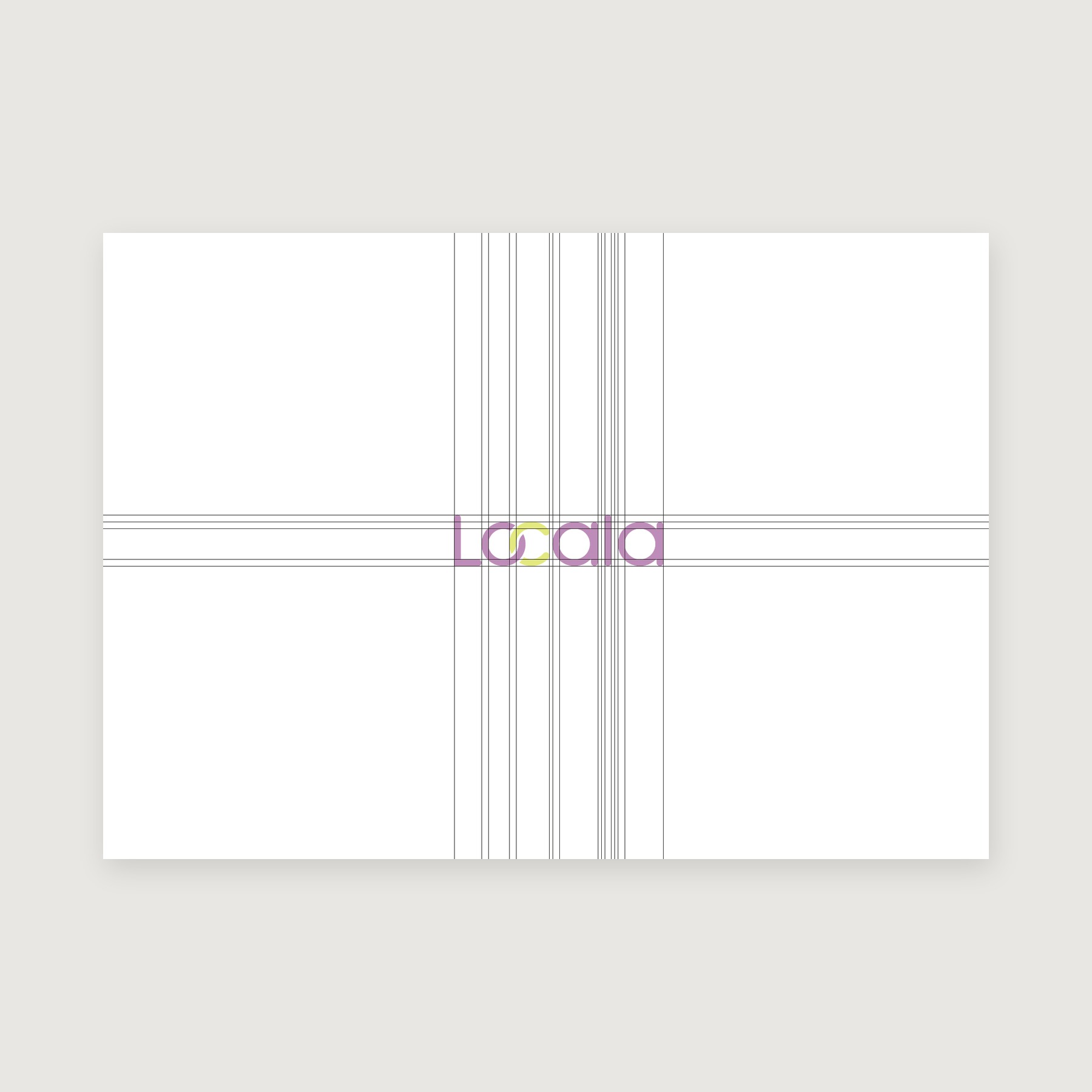
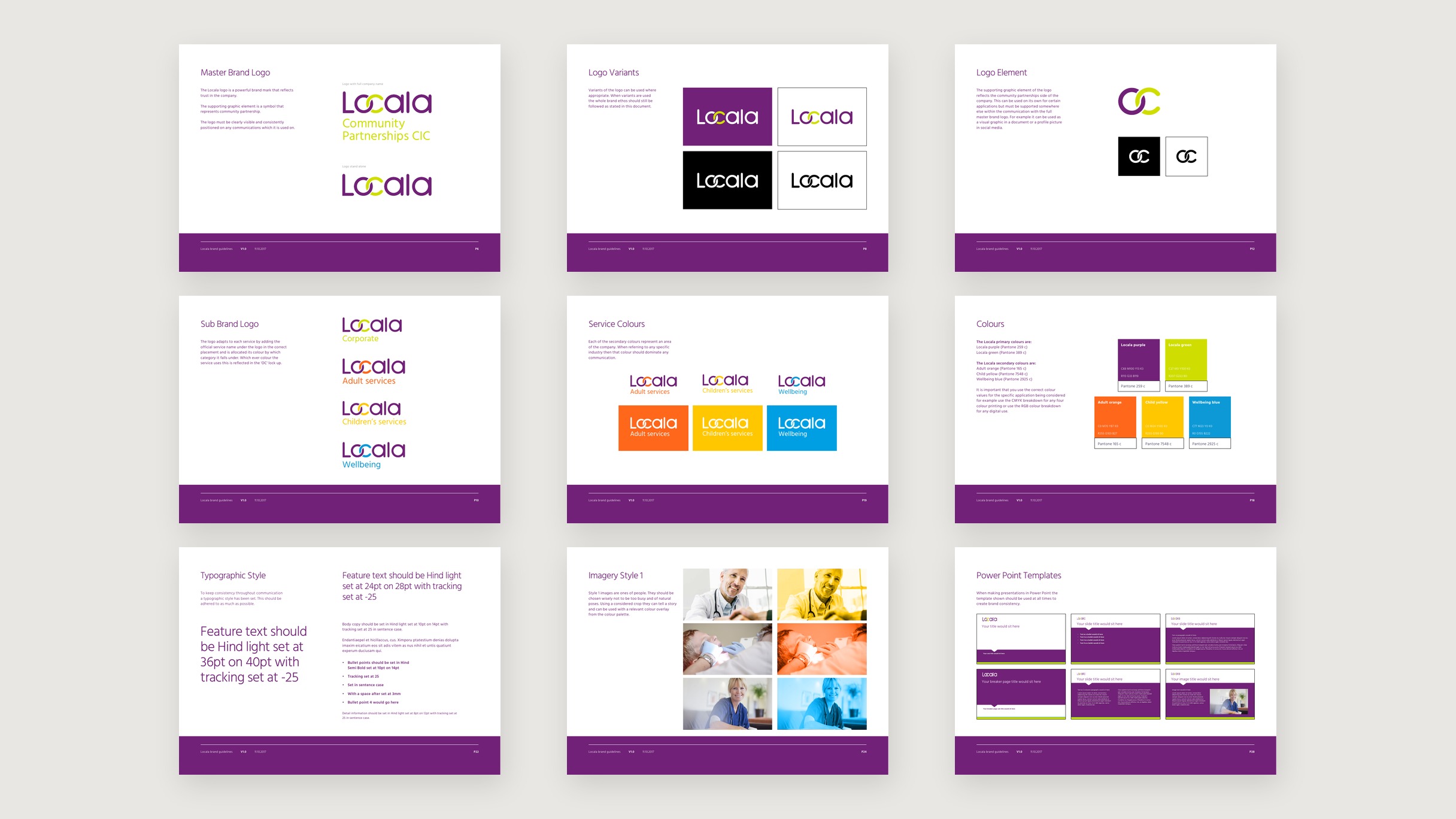
Then the brand project properly. The mark redrawn on a construction grid, purple and lime, Hind for the type, and a lockup for each family of services: corporate, adult, children’s and wellbeing, each in its own colour. A health provider runs a lot of services under one name, and the system has to let each be found without any of them leaving the brand.
What was done
By October 2017 the guidelines ran to 31 pages, with the letterhead, business cards and PowerPoint templates made from them.
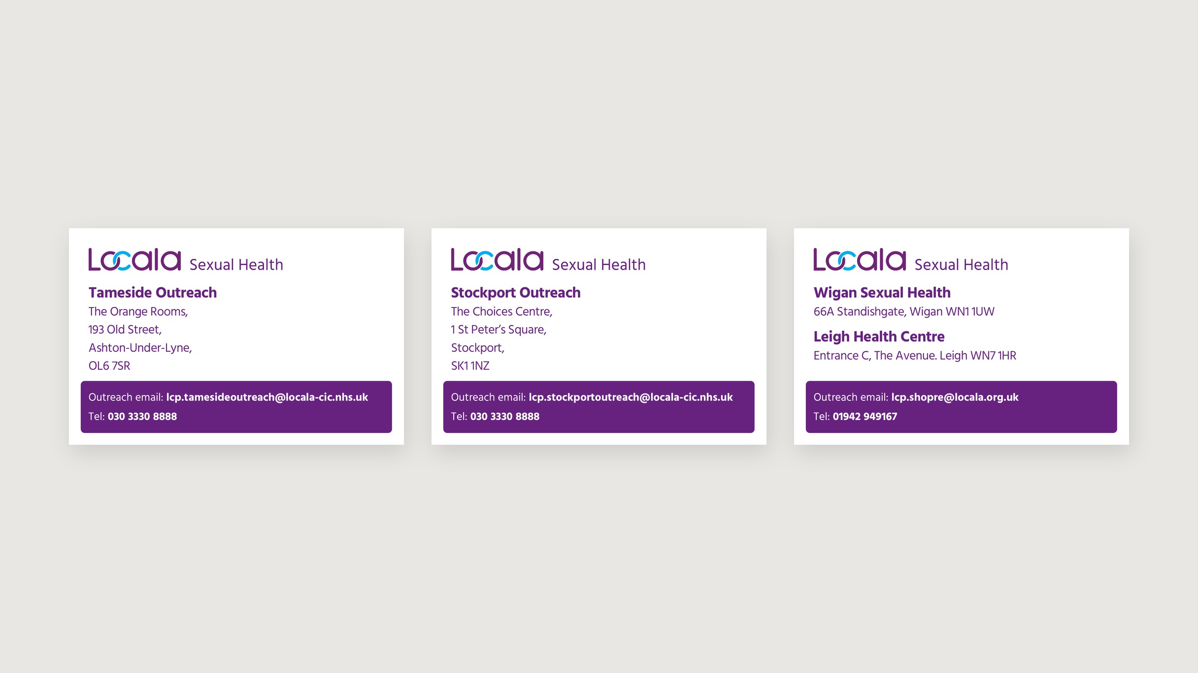
In August 2026 the sexual health service put Tameside and Stockport on one phone number and the outreach business cards were changed and sent back the same day. The mark on them is the one we drew in 2017.