The brief
Rare Disease Research UK was set up in July 2023 with £14 million from the Medical Research Council and the National Institute for Health and Care Research: a coordinating hub at Newcastle University and eleven research nodes, each working on its own set of rare diseases.
The approach
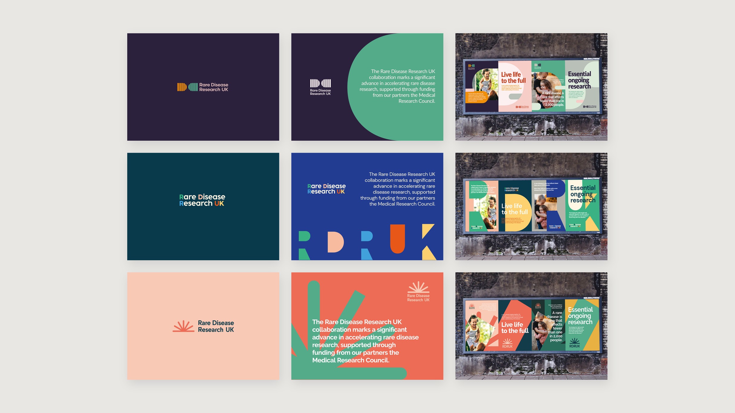
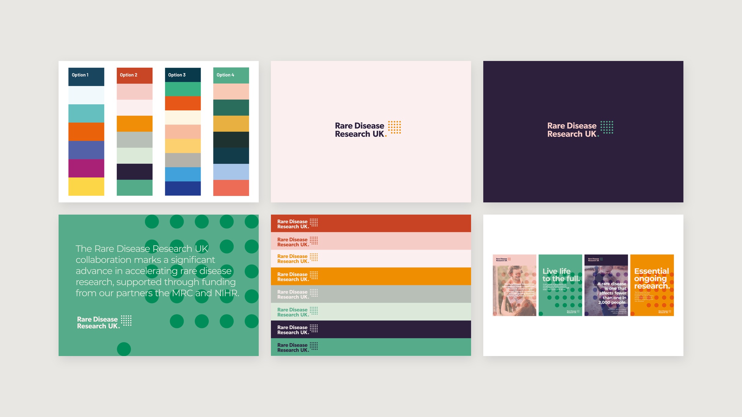
Three moodboards in August 2023: friendly and bright, bold and primary, modern and calm. The calm one was picked, and in September we drew four logo routes from it. Striped half circles. The letters RDRUK cut into big coloured shapes. A sunburst. And a grid of dots. Each one went up on the same four posters on a billboard, so they could be judged in use rather than on a white page.
The dots went through. The icon stands for one person out of the many a rare disease affects, and the dots carry on through the rest of the brand as pattern. Then colour: four palettes, and the second, eight colours from burnt orange to navy, went into the chosen concept at the end of September.
What was done
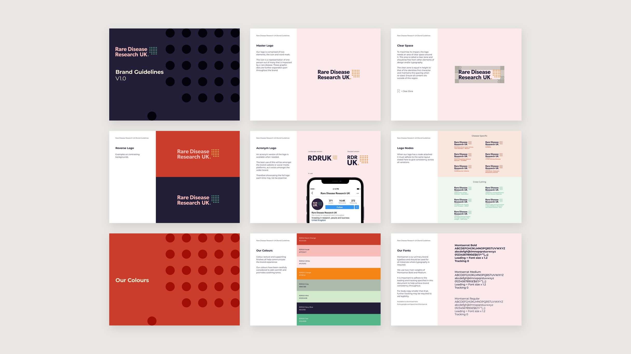
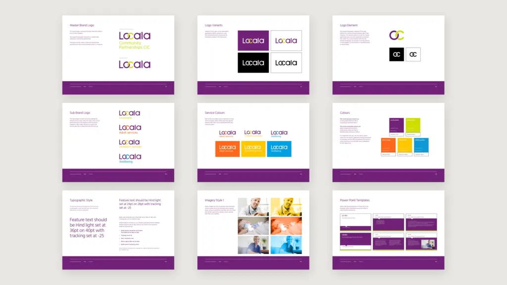
The guidelines followed on 30 October 2023. The master logo, clear space, reverse versions, an RDRUK acronym for social profiles, eight colours and Montserrat in two weights. And a lockup for the nodes, so each of the eleven research teams carries its own name under the same mark, split into disease specific and cross cutting.